Disclaimer: This project was created as a class assignment for a Strategic Communications course at Elon University.
It is entirely fictional. All campaign materials and program details were developed for academic purposes only. This work is not affiliated with, endorsed by, or connected to Outshine in any way.
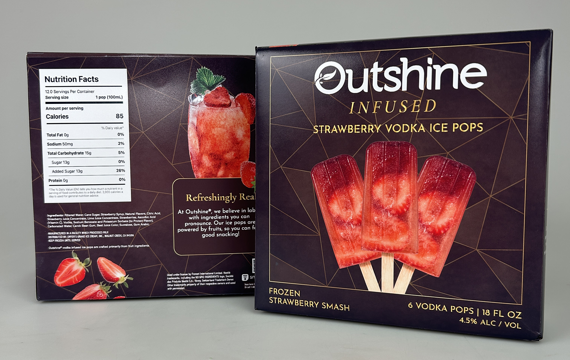
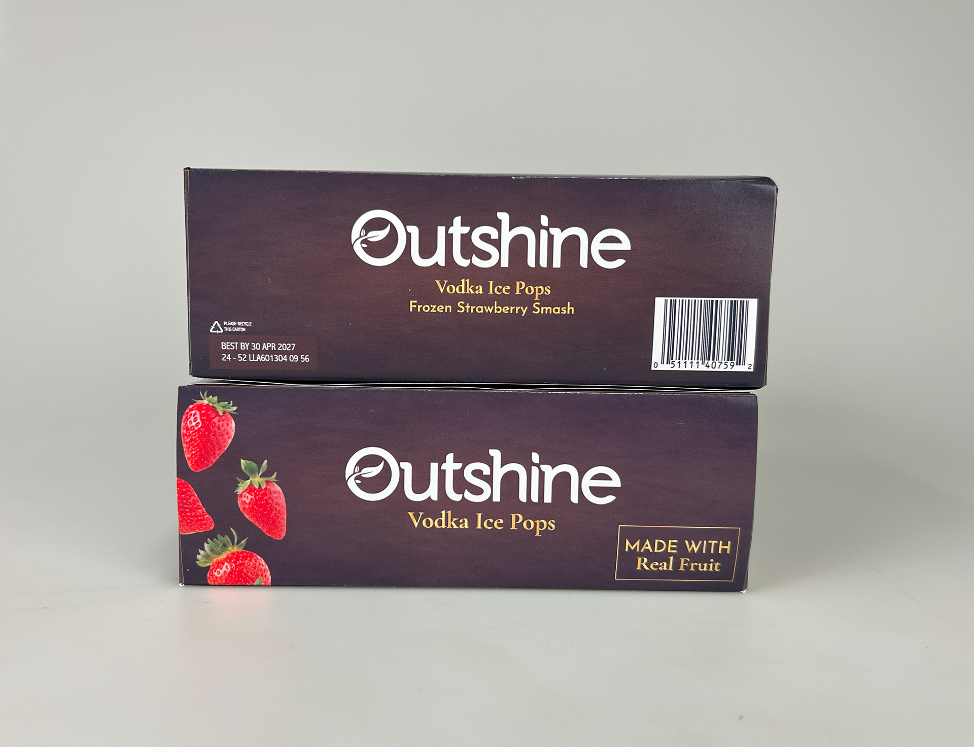
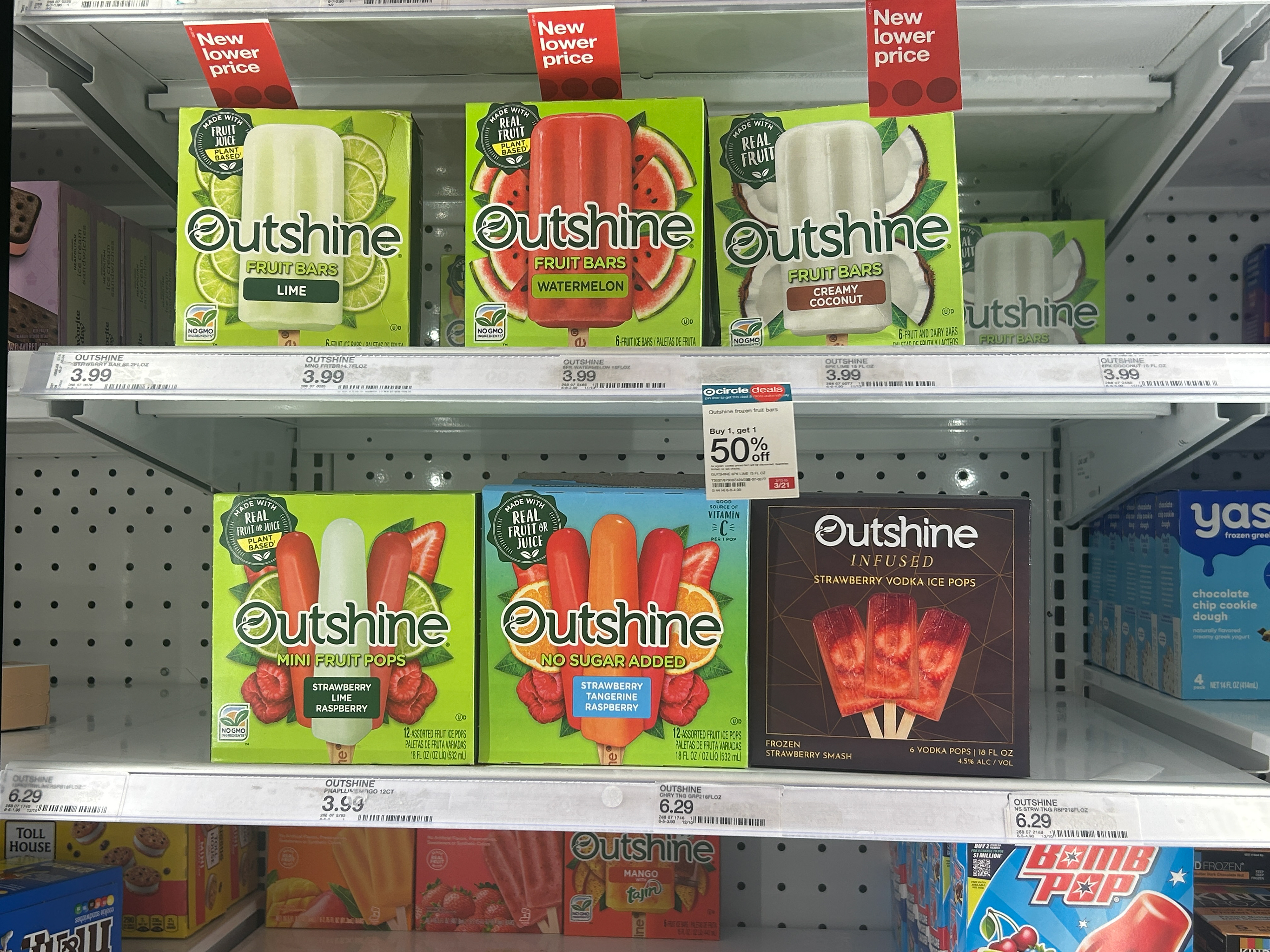
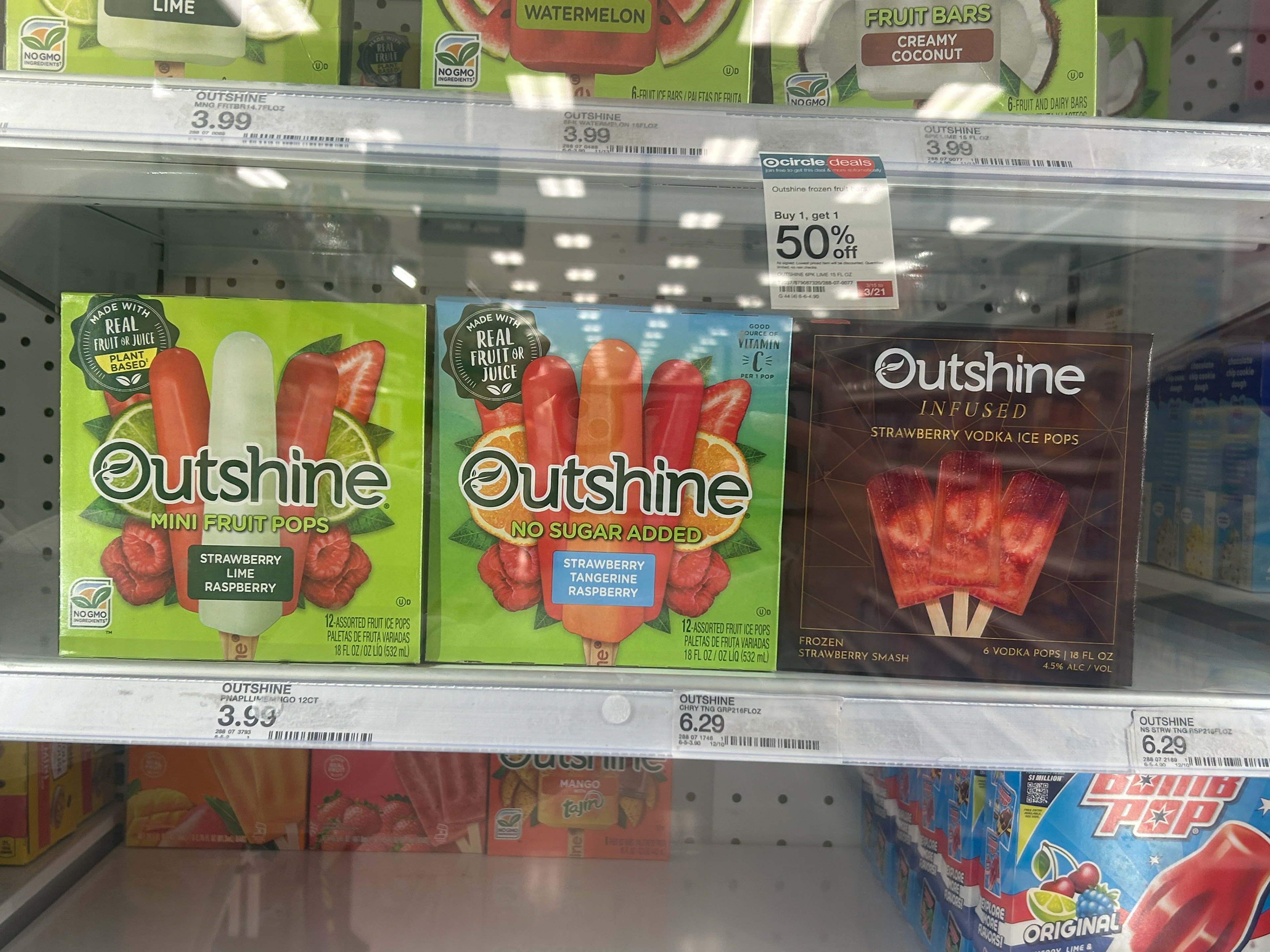
The answer was to go in the opposite direction. Where the frozen aisle shouts, Outshine Infused is quiet. A deep, dark base palette. Gold accents. Custom textures. The packaging does not compete with what is around it. It contrasts with it, and that's what makes you stop and pick it up off the shelf.
I decided to create the strawberry variety of the vodka-infused line. The final package was printed, physically assembled, and photographed by me using Adobe Illustrator and Photoshop, with the structural die line built in Pacdora.
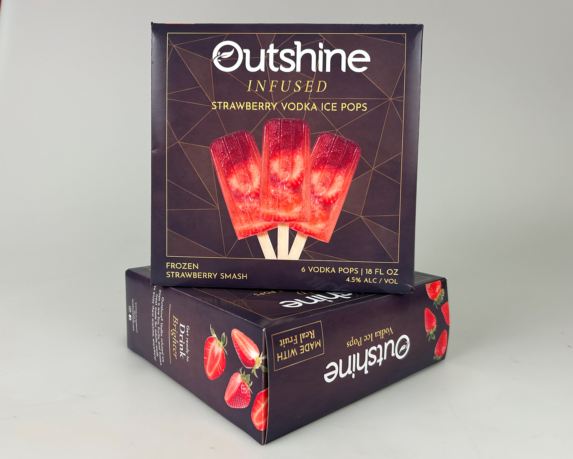
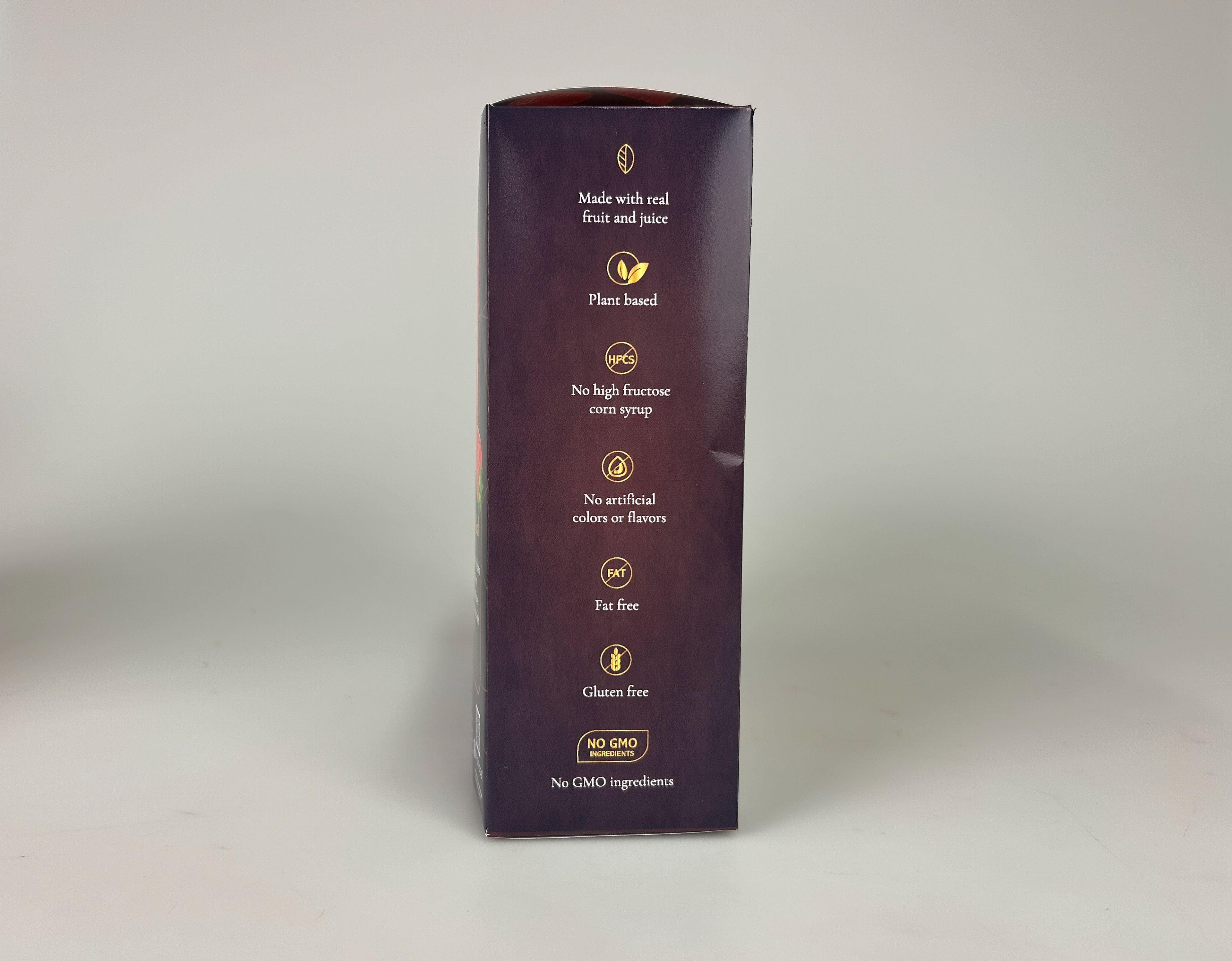
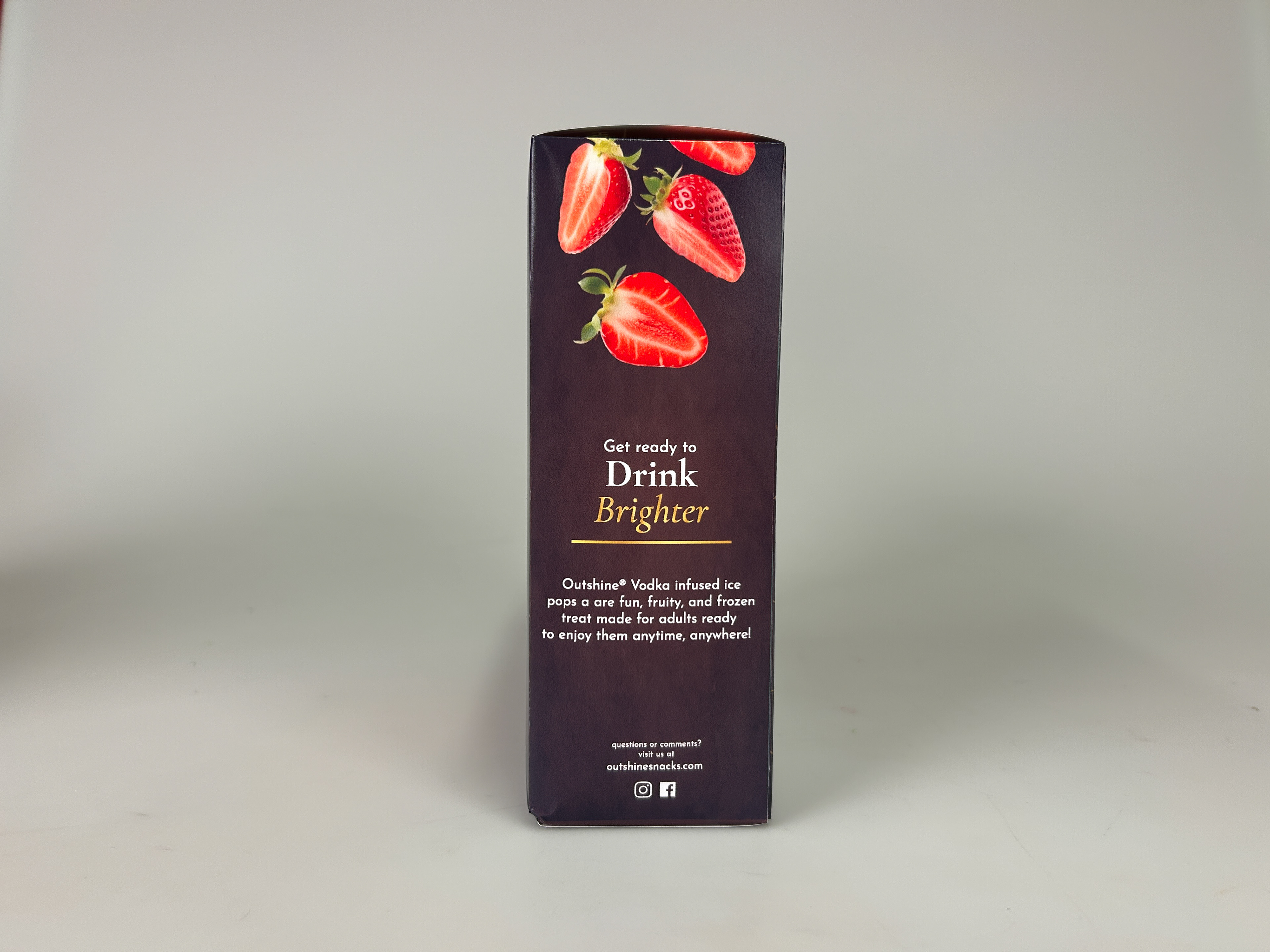
I took some pictures of how the product would look in real life. These were taken in the freezer aisle of my local Target.
Yes, the final product looks great, but this project was all about the process. I dealt with everything from brainstorming, printing errors, crafting the box, and everything in between. It started with a blank page and ended with a shelf-ready packaging design.
Learn more about how it got to what you see now by clicking the process link!