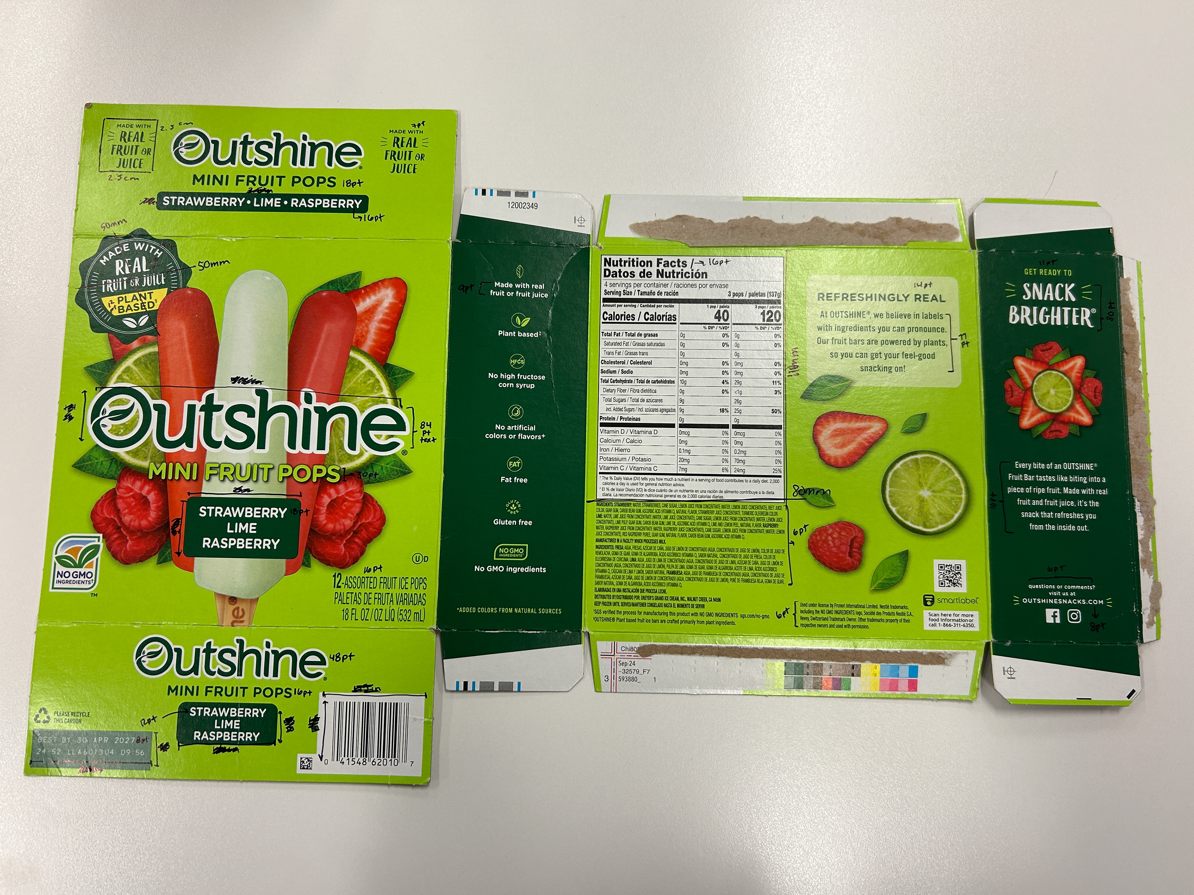
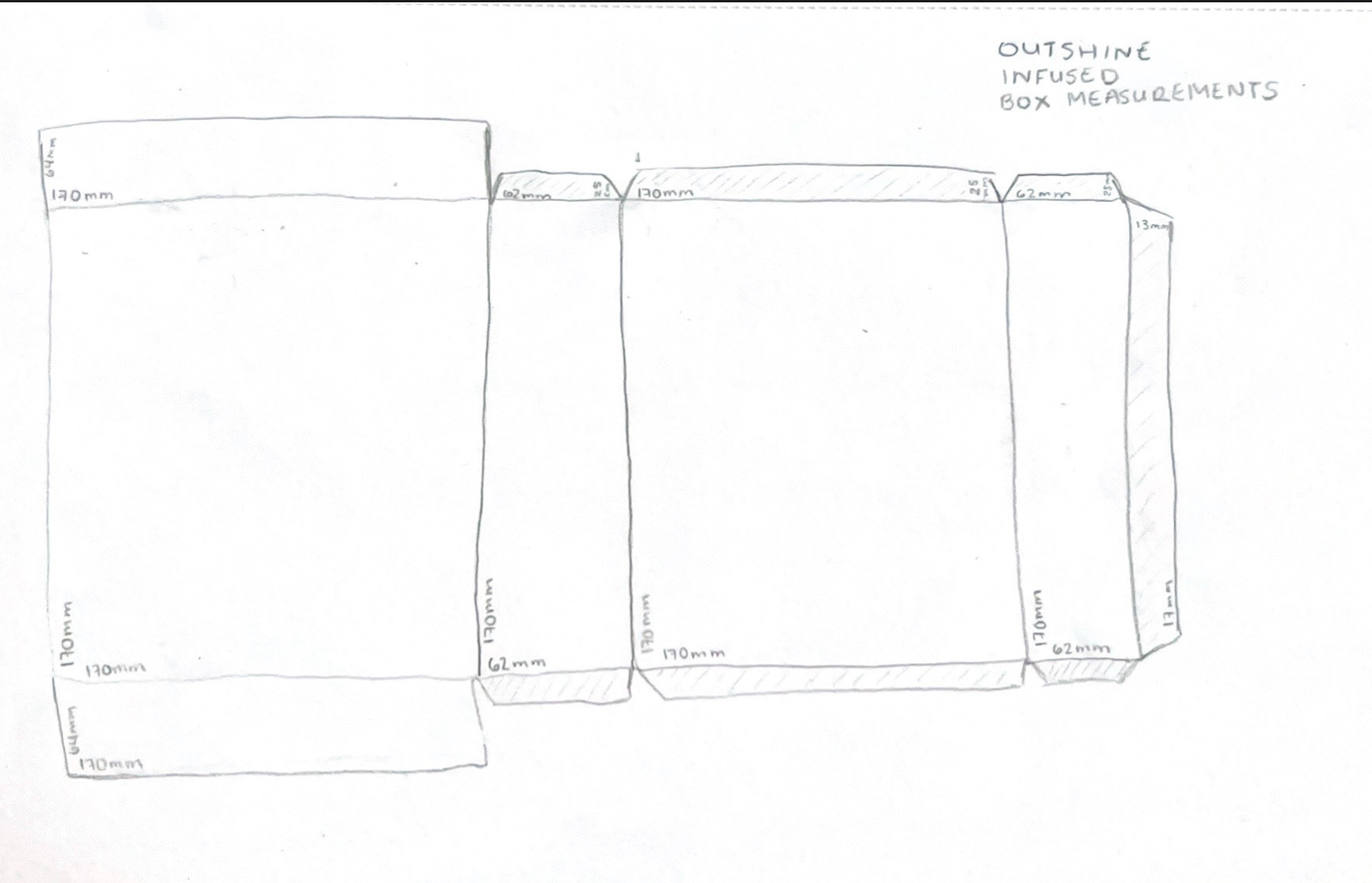
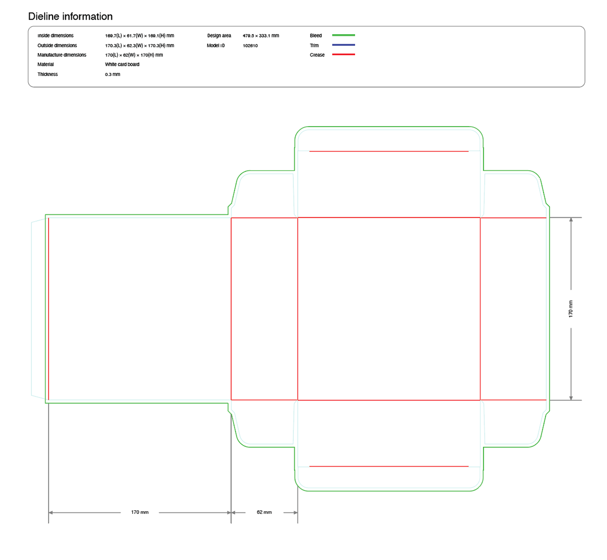
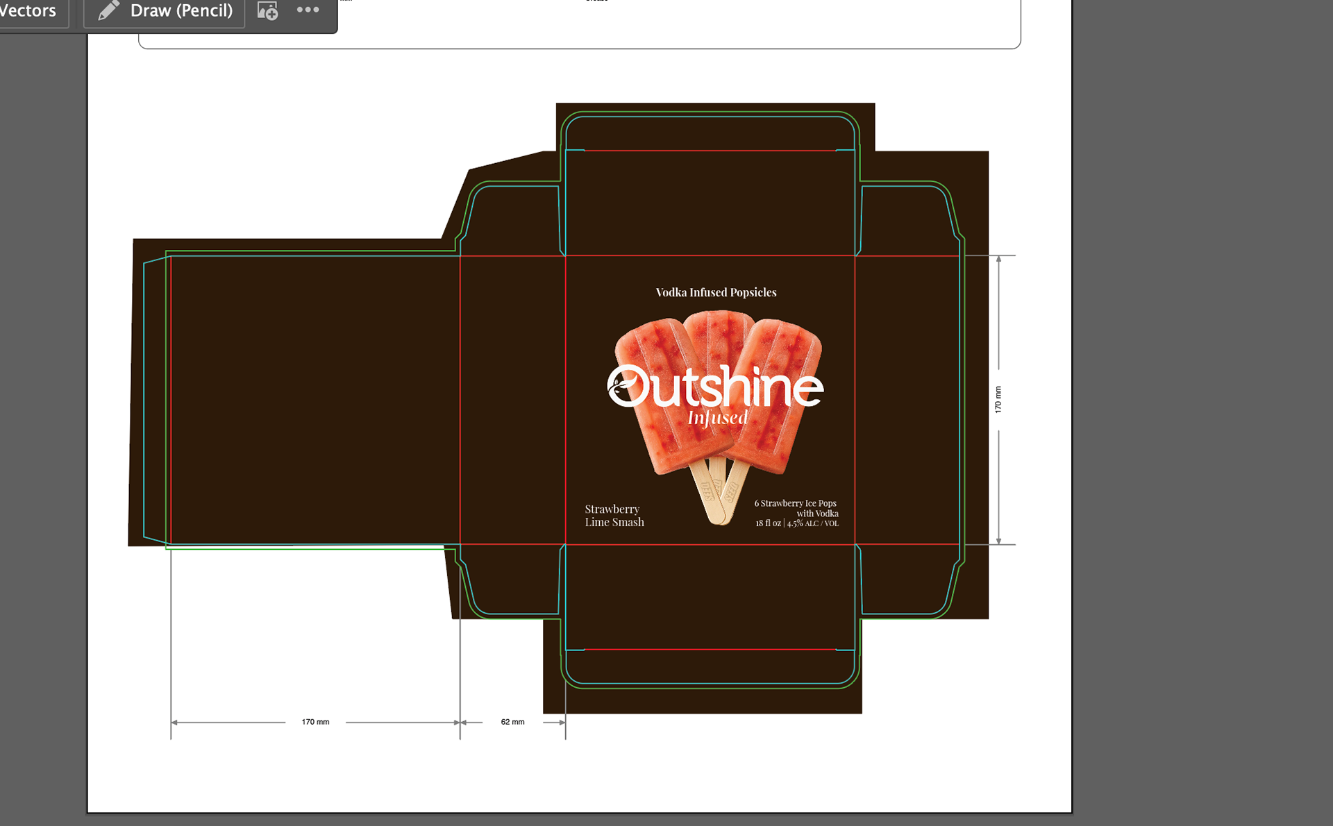
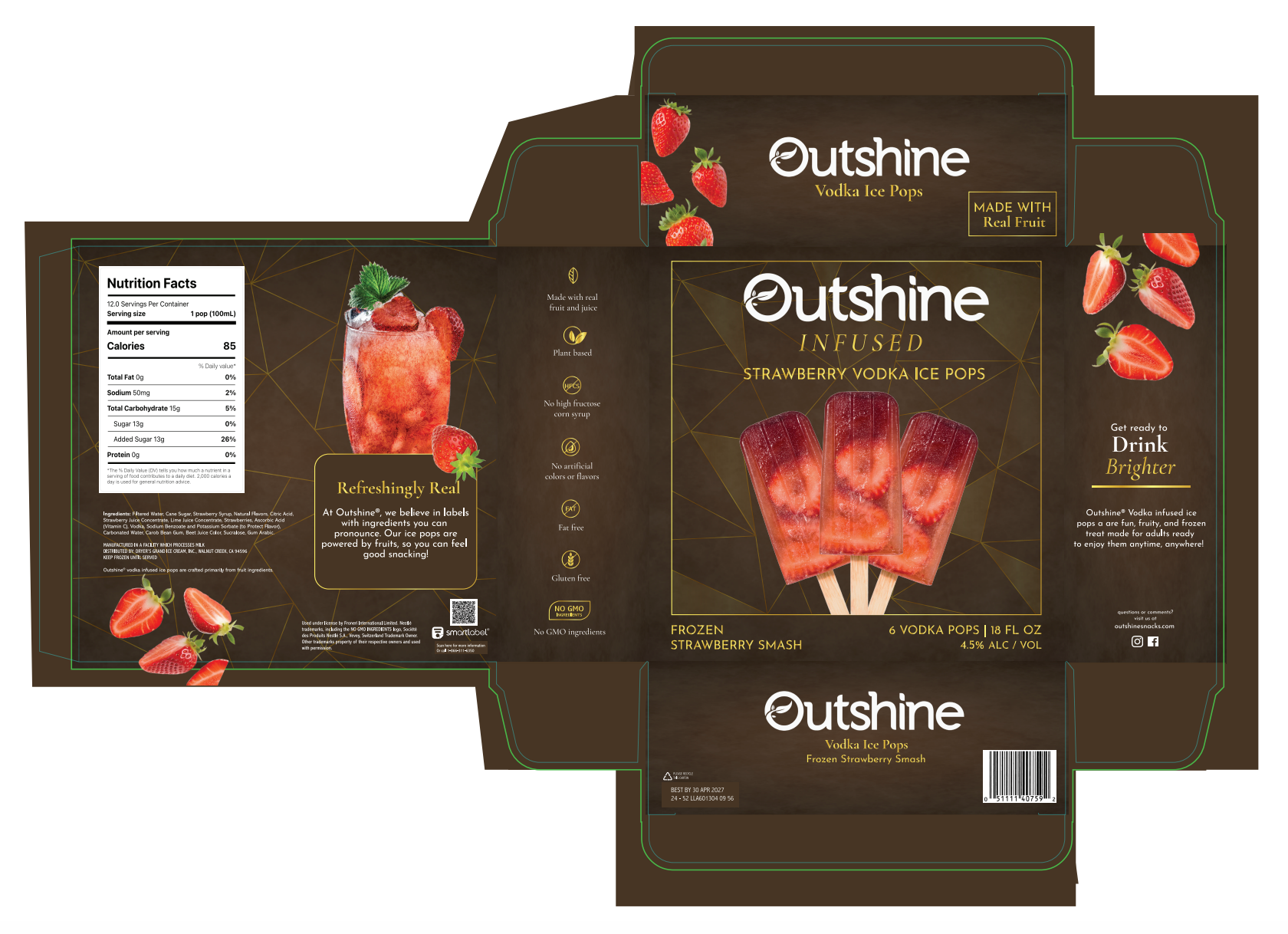
Before any visual design could happen, I needed a real structure to design for. I measured an actual Outshine popsicle box and used those dimensions to build a to-scale die line in Pacdora. This forced every decision, panel sizes, label placement, fold lines, text size, and where text could and could not live, accounting for how the box would physically exist in the world. Designing the structure first meant the visuals had real constraints to work within.
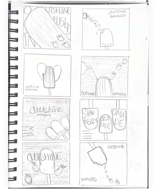
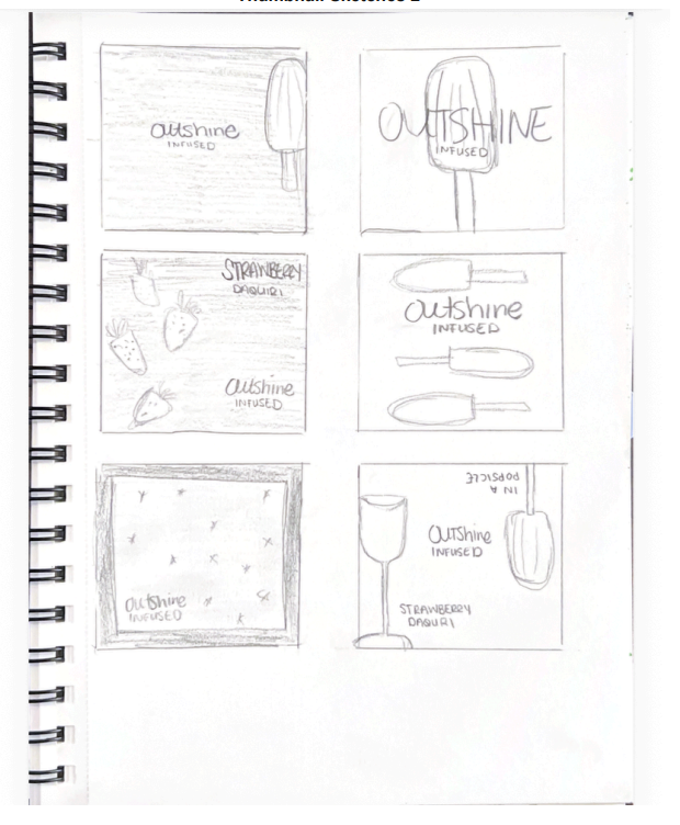
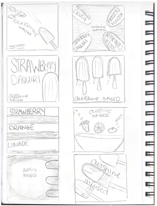
With the die line established, I worked through thumbnail sketches of different layout directions for the front panel. This is where I figured out the hierarchy: what the eye should hit first, where the product name lives, and how much space the imagery gets versus the typography. Sketching at this stage is faster than iterating in Illustrator, and it meant I arrived at the software with a clear direction rather than starting from a blank artboard.
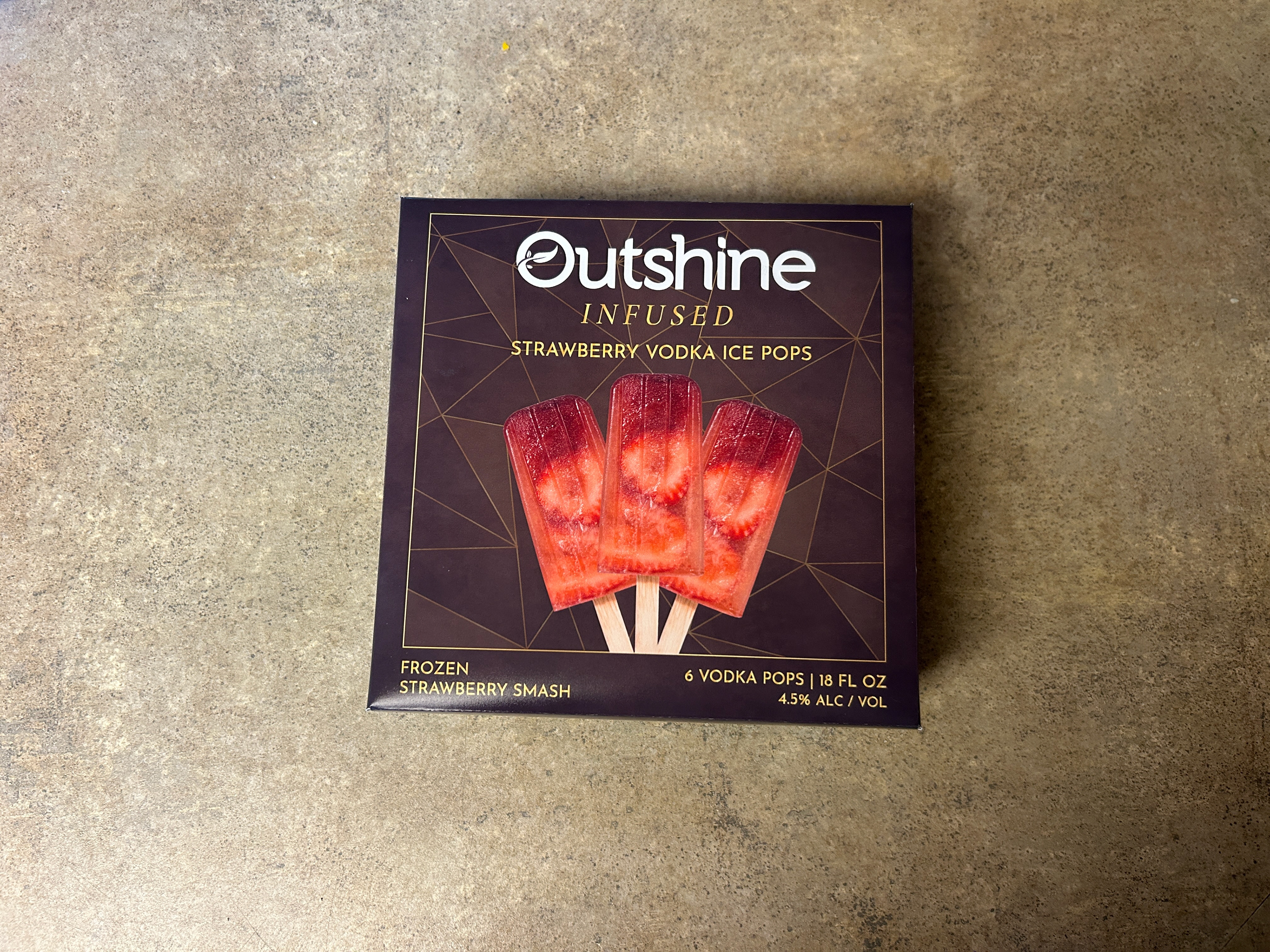
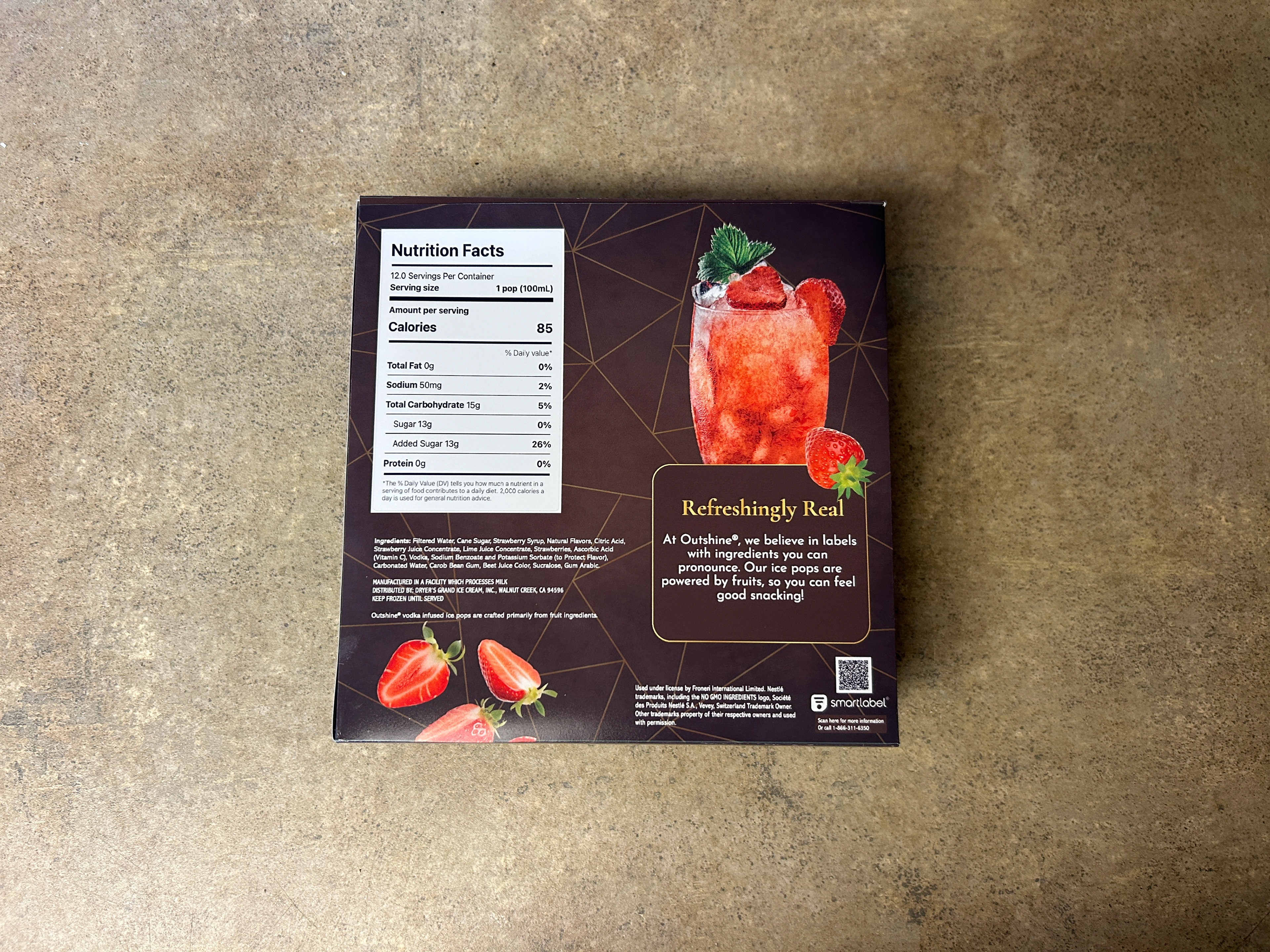
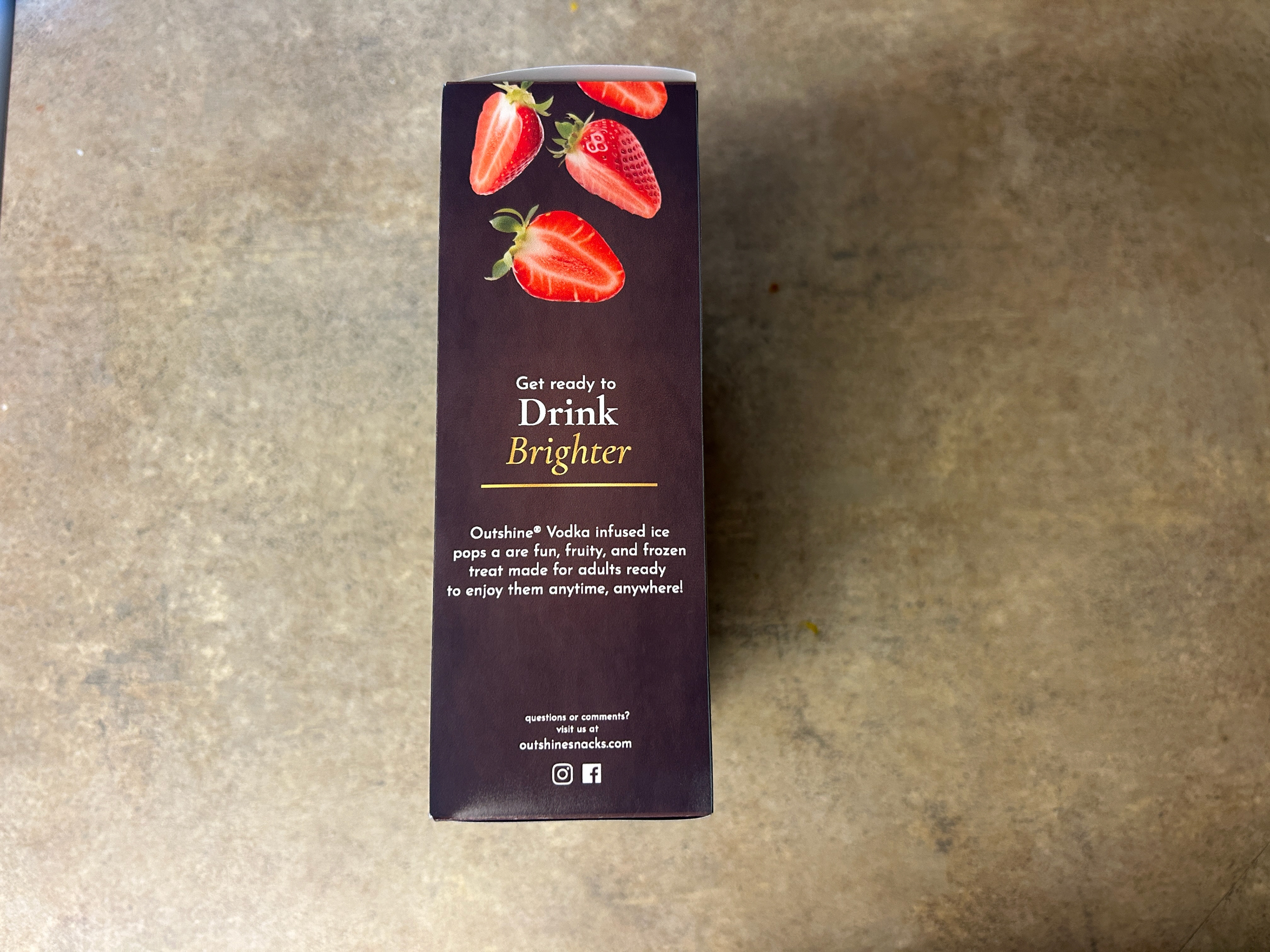
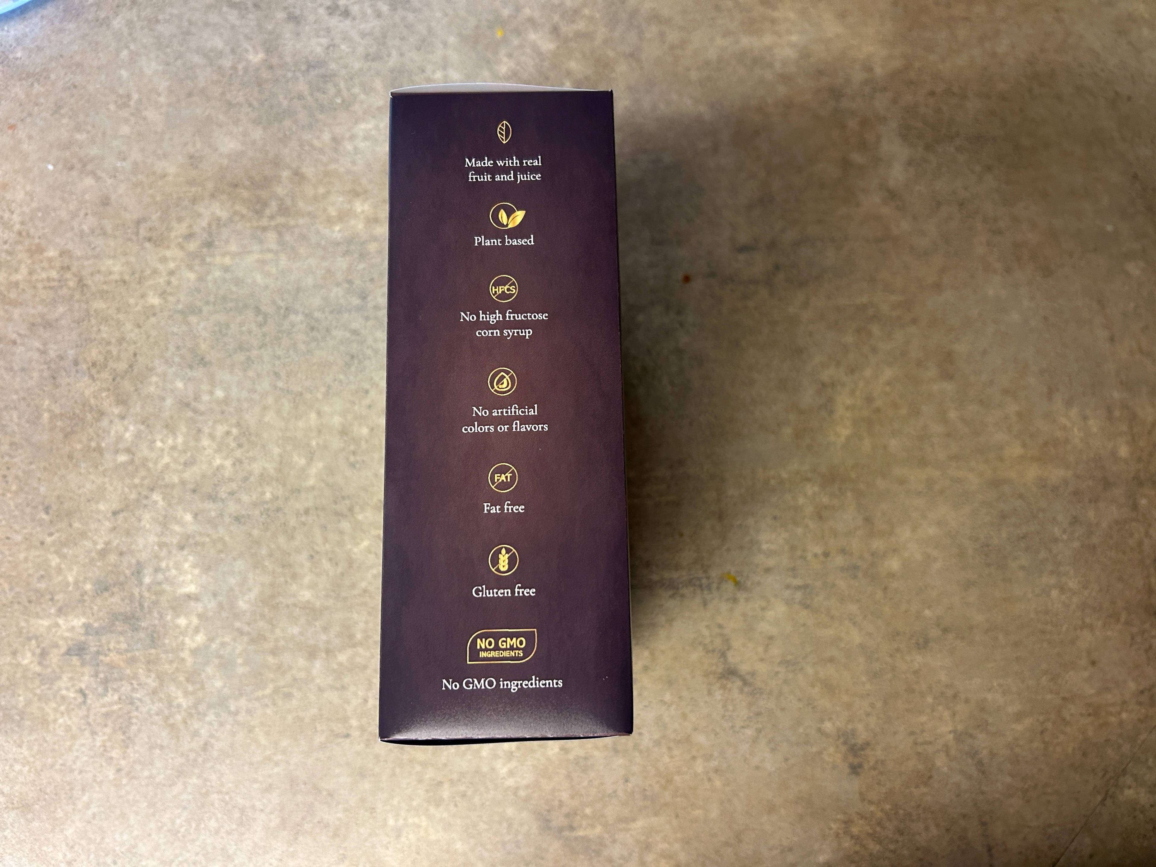
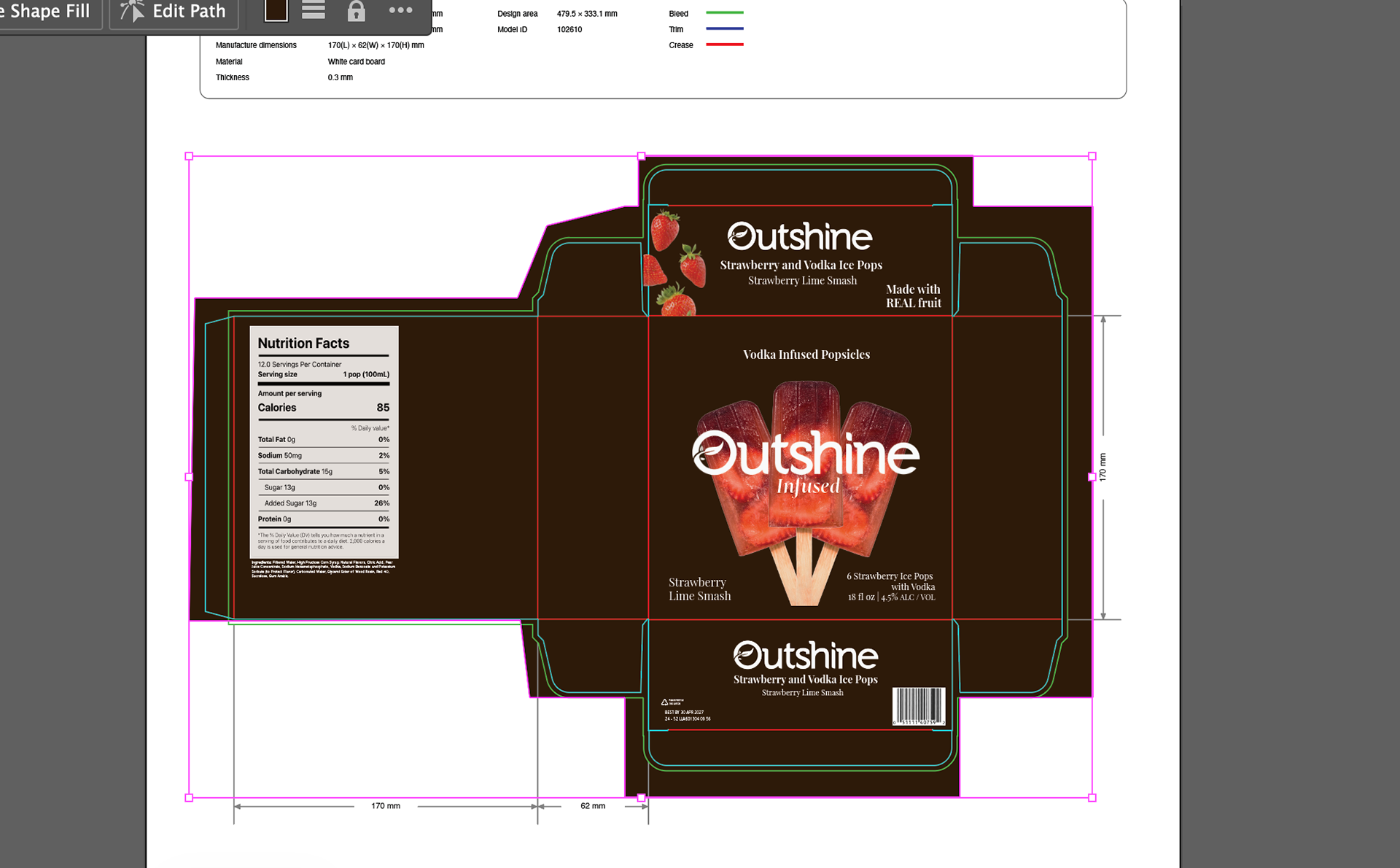
I took the strongest thumbnail direction into Adobe Illustrator and designed all sides of the box. The front panel leads with the dark palette and gold accents. The side panels contain most of the structural information, nutrition facts, ingredients, and legal copy, while maintaining the front's visual language. I used Photoshop to create the texture and edit the photography displayed on the packaging. I created the background pattern and gold gradient from scratch in Adobe Illustrator. I went through multiple rounds of revision and edits before the design was ready to print.
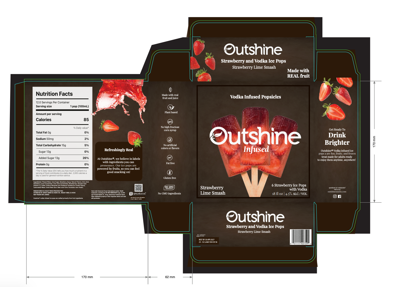
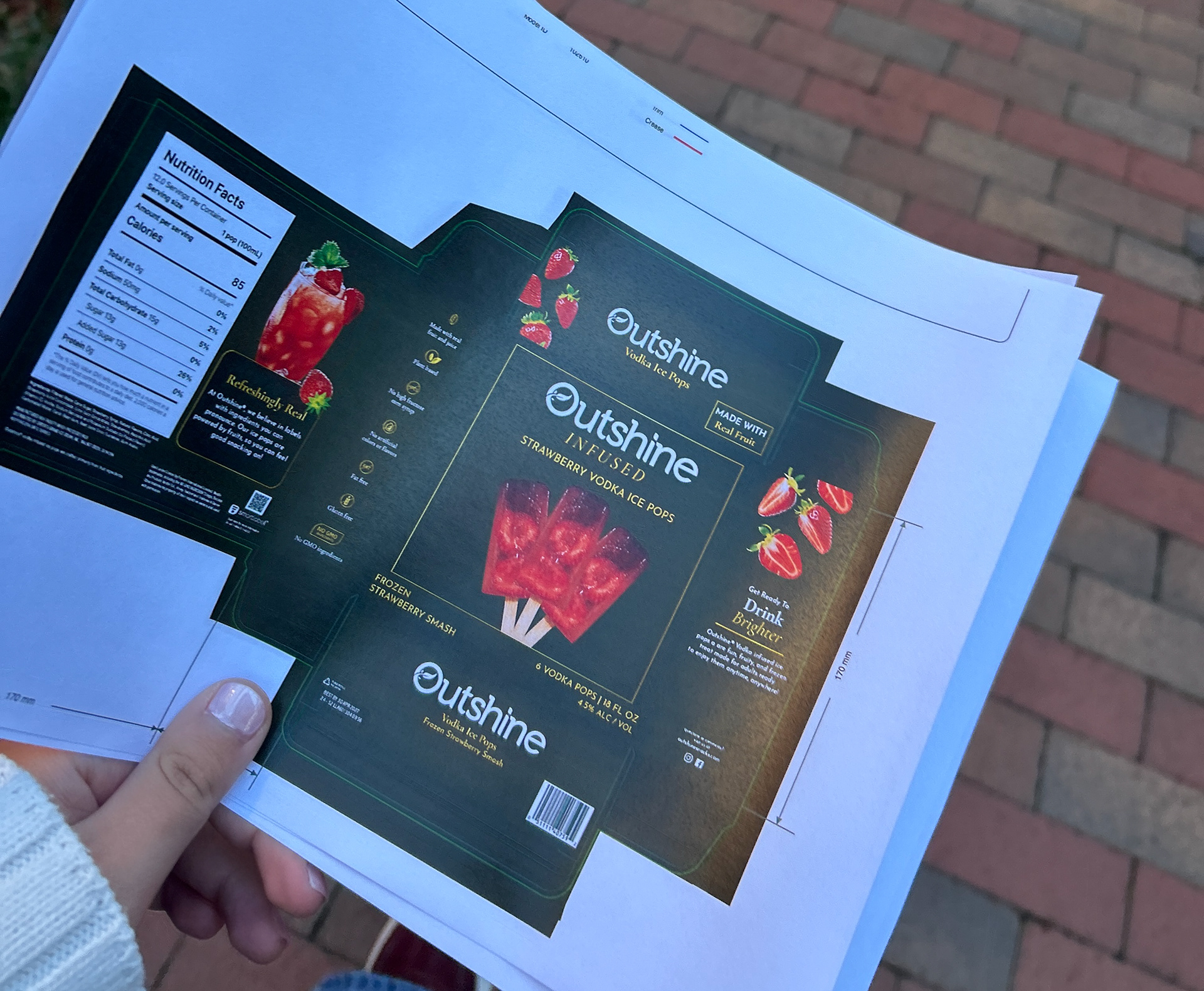
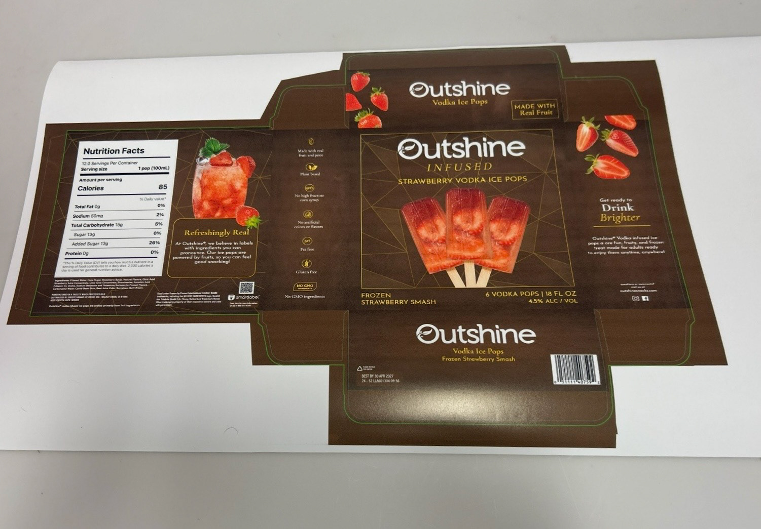
Once the design was finalized digitally, I first printed the flat die line at a smaller scale as a test print. I then printed out the die line to scale, cut it out by hand, and assembled the physical box. Seeing the packaging in three dimensions revealed things a flat mockup never would. Small adjustments happened at this stage.
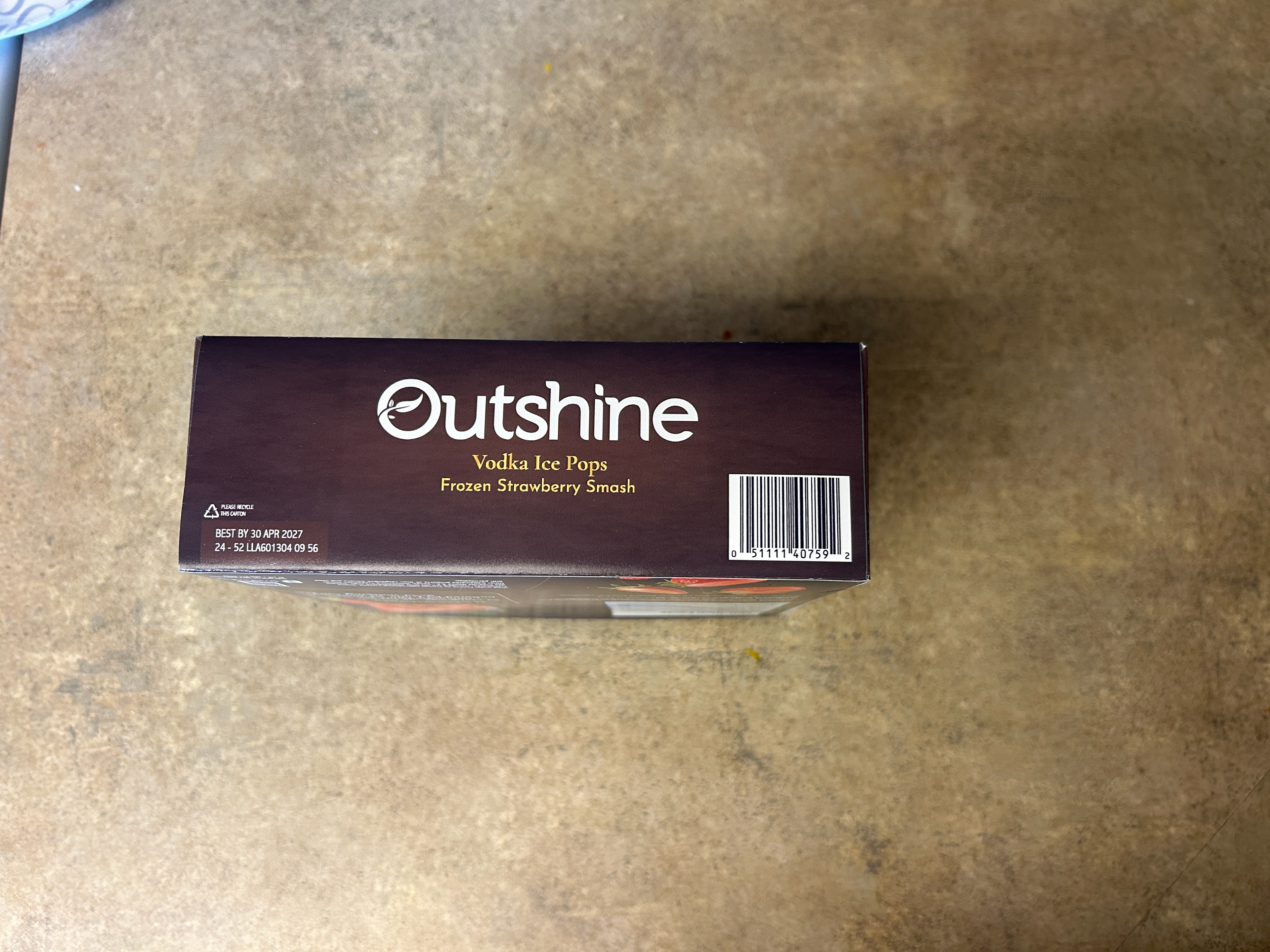
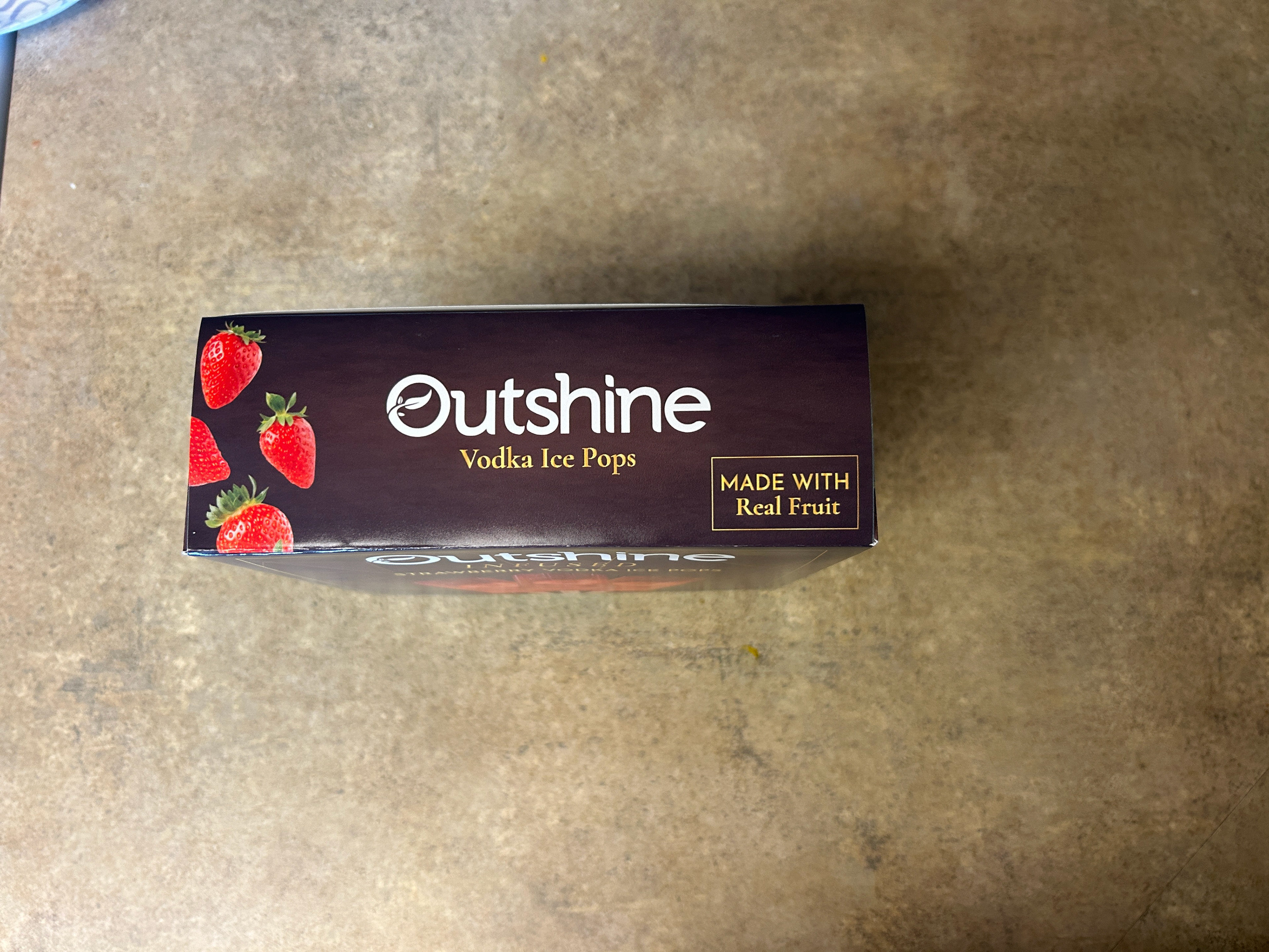
Once the box was built, I photographed it in context so the work could be evaluated as a consumer would: a real object, not a digital file or mockup.