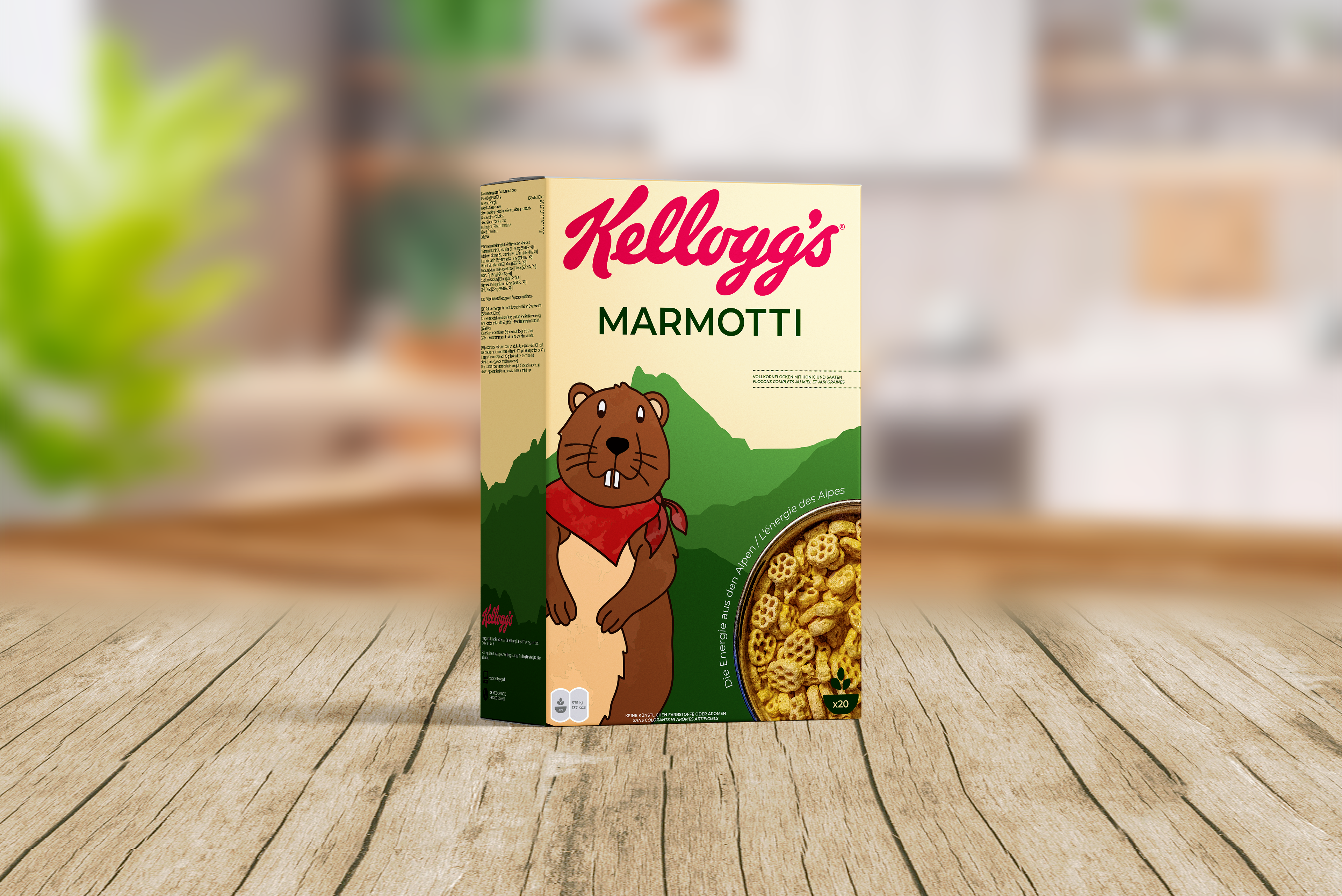
Before designing, I researched Swiss consumer expectations around food transparency, ingredient quality, and minimal visual branding. Swiss parents tend to favor natural color palettes, clean typography, and packaging that communicates honesty rather than excess. Swiss children love character illustrations and exploring the wild. Marti the marmot mascot stemmed from that idea. These insights came partly from research, and partly from spending a year living close to Zurich, where I saw firsthand how Swiss consumers engage with packaging, food labeling, and brand trust.
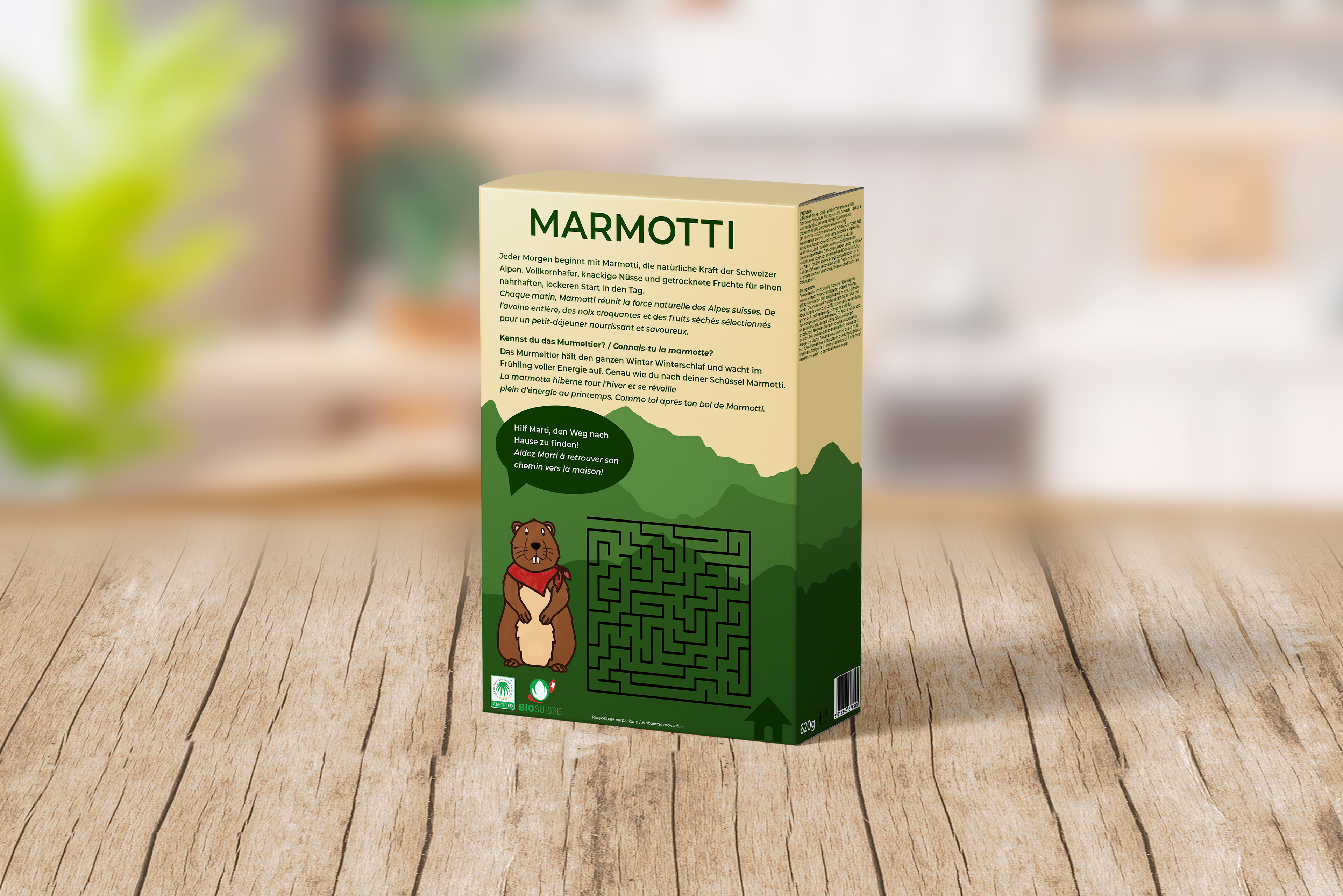
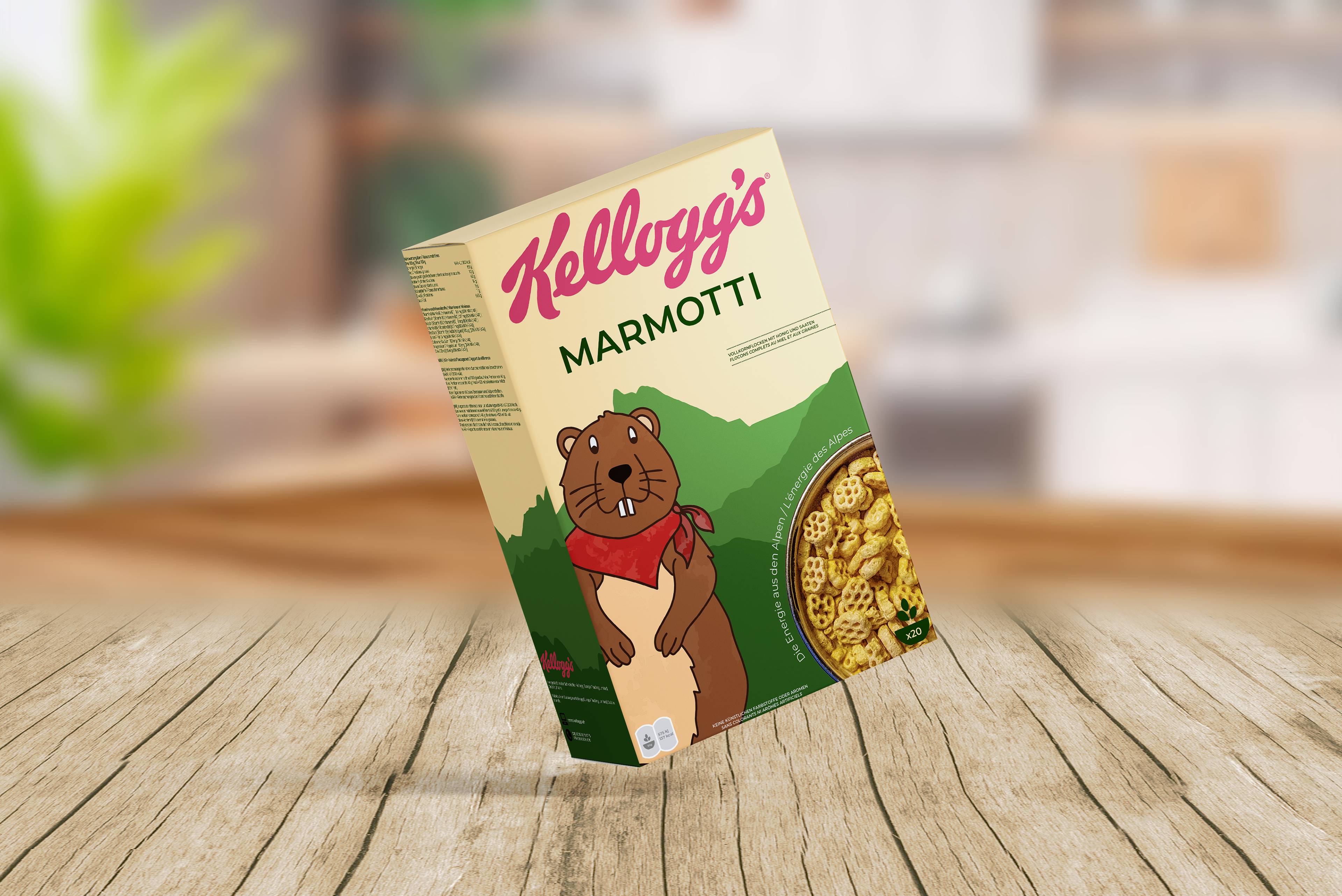
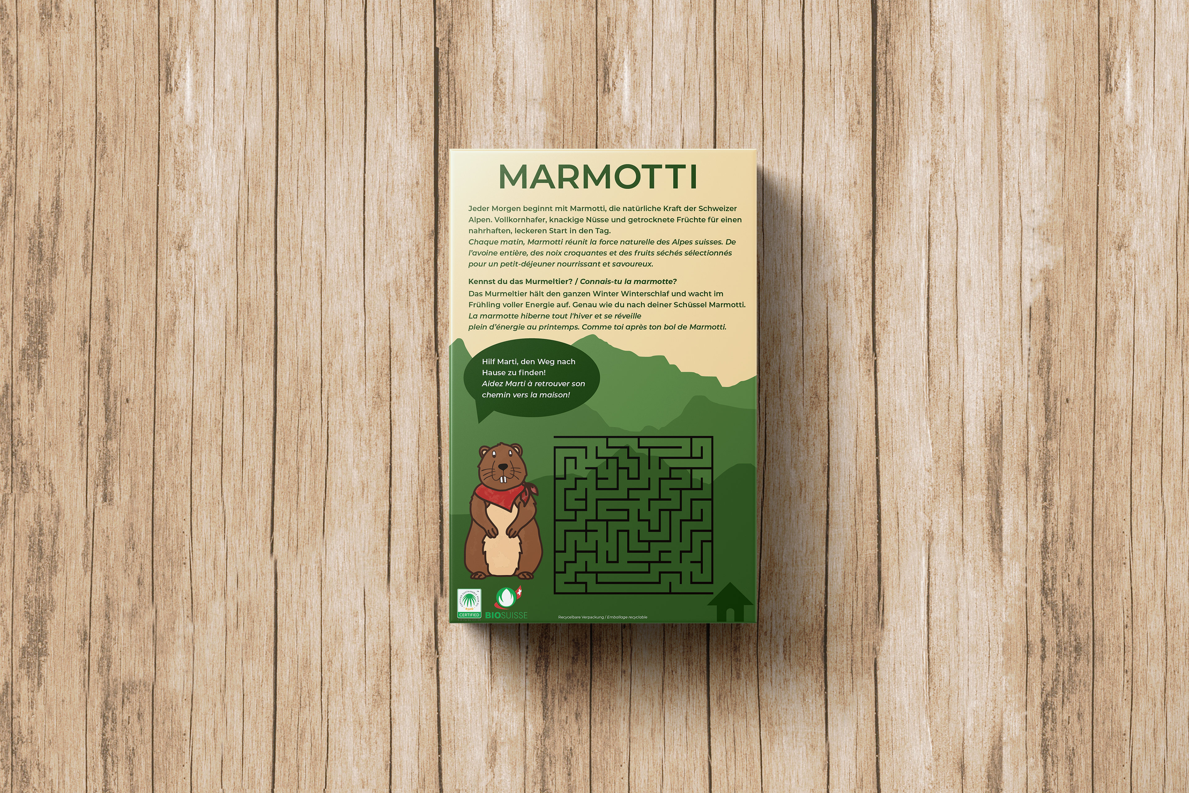
I positioned Marmotti as a healthier alternative to sugar-heavy, character-driven cereals by balancing nutritional trust with child appeal. The earthy green palette and restrained layout signal freshness and quality to parents, while Marti the Marmot creates personality and familiarity for children. Every layout decision gave equal visual weight to both French and German to ensure accessibility across regions and avoid linguistic hierarchy.
Rather than imitating loud American cereal branding, Marmotti was intentionally designed to resolve the tension between parental scrutiny and child preference. This project demonstrates my ability to define a clear audience, identify a market tension, and translate research into strategic brand positioning.