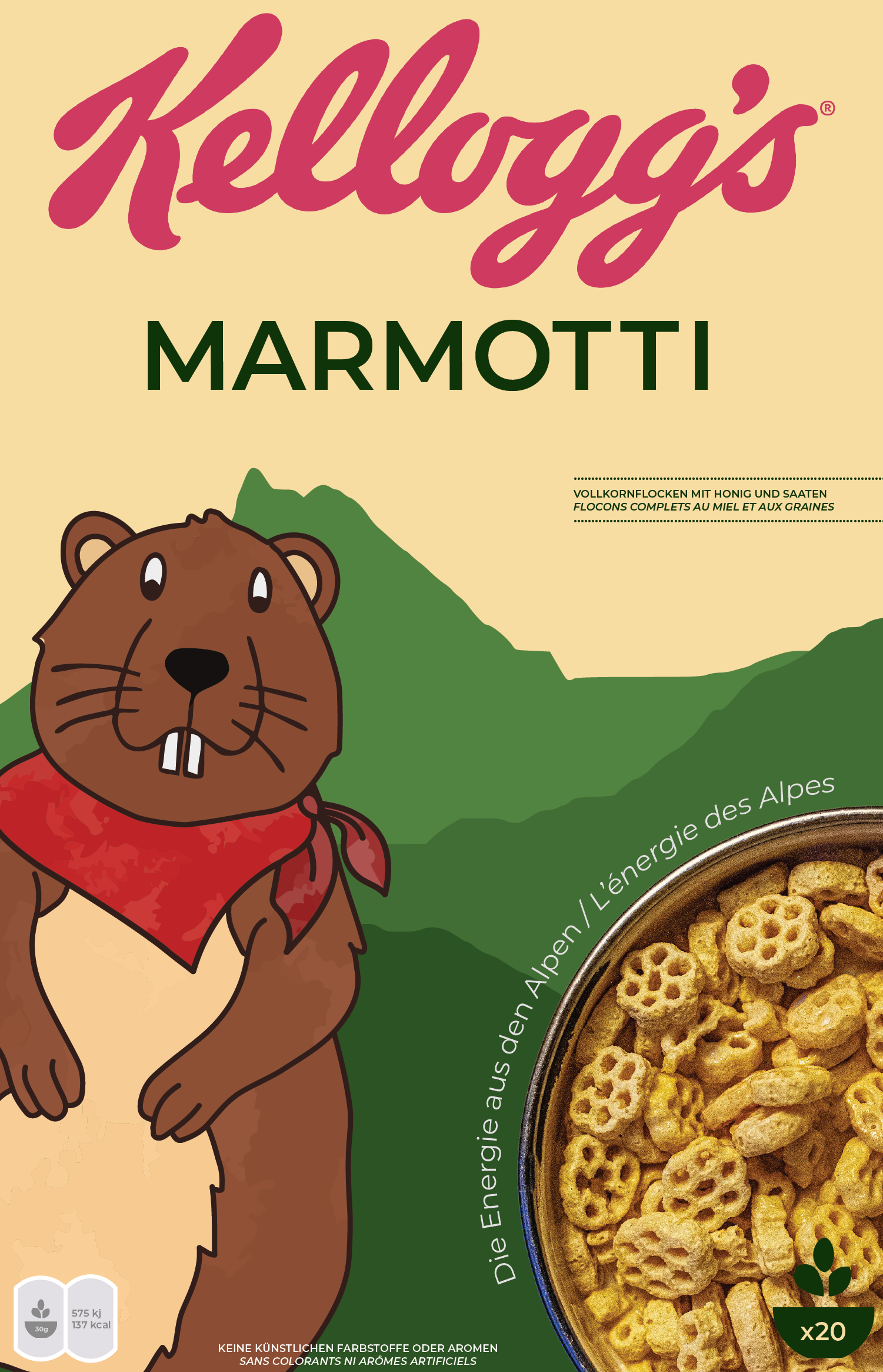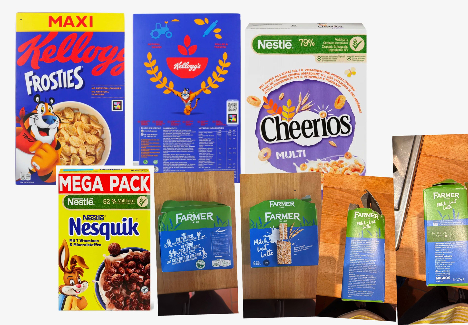
I researched Swiss consumer expectations before sketching anything. Swiss parents prioritize food transparency, minimal ingredients, and packaging that signals quality through restraint rather than color and characters. At the same time, the product needed to appeal to children. That tension, parental trust versus child appeal, became the central design problem. I started with some initial sketches in Procreate that served as the base layout for the cereal box.
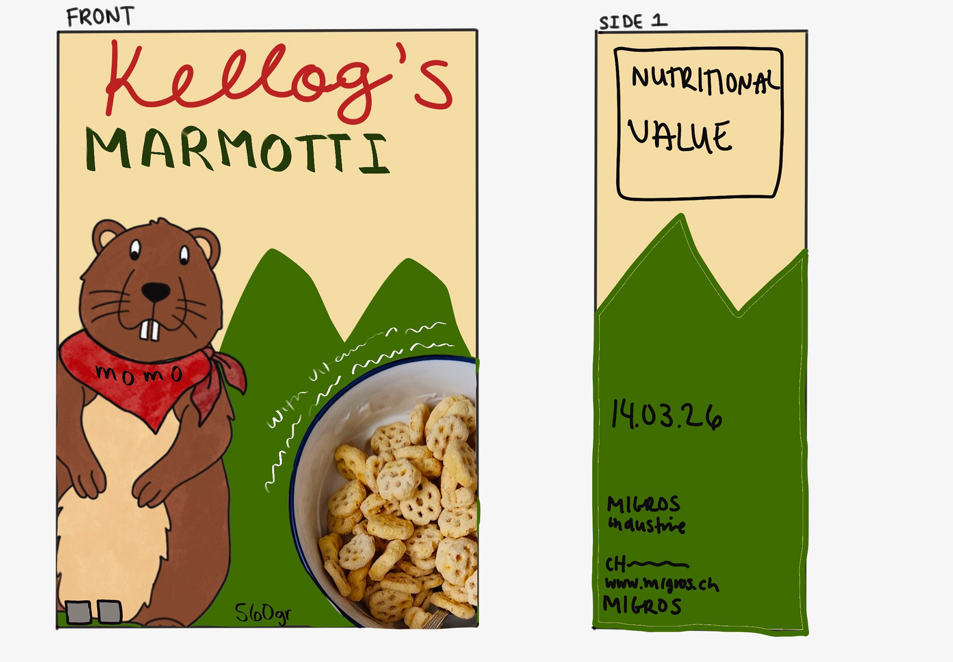
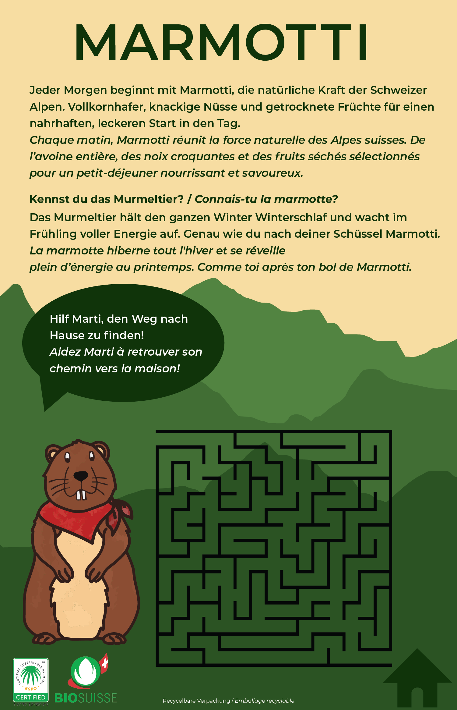
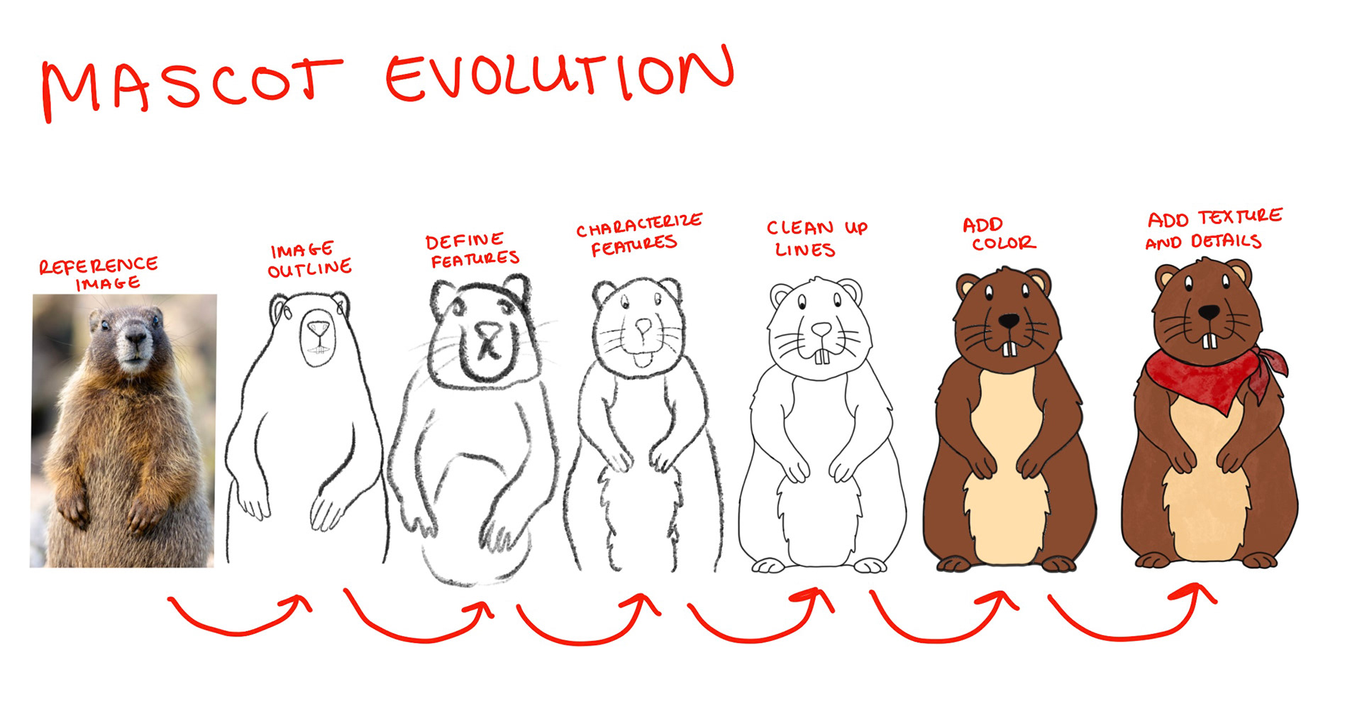
Why a marmot? The marmot is native to the Swiss Alps and culturally familiar to Swiss families. It also gave me a character that felt local and specific rather than generic. I wanted the mascot to feel like it belonged to this market, not like it had been imported from an American cereal brand. I documented the process of designing Marti from early sketches through the final character, which you can see below.
Naming the character was a strategic decision. The name Marti is easy to pronounce in both French and German, which matters when your package is going to be read aloud by children in two different linguistic communities. A name that only lands in one language would immediately signal which audience the brand actually prioritized.
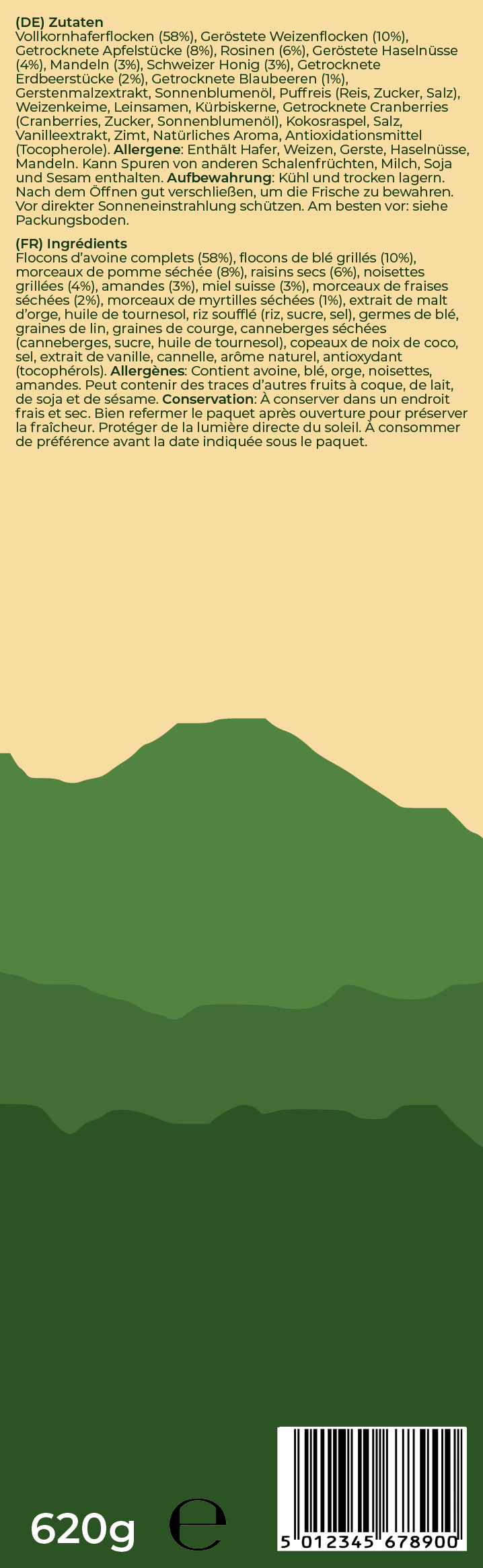
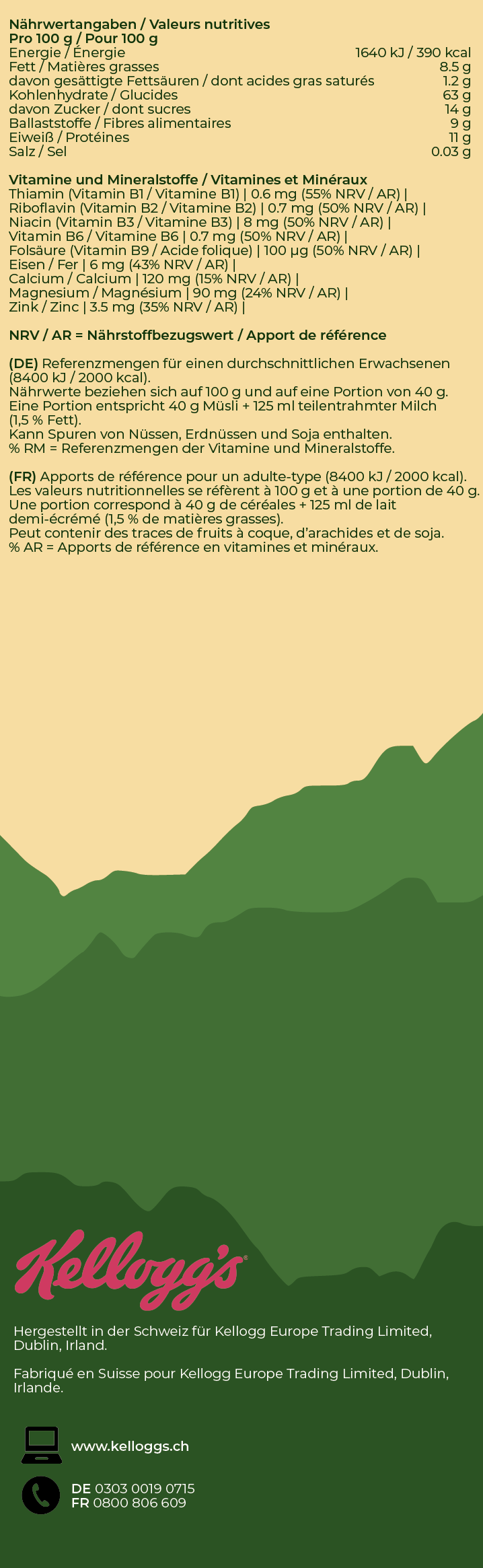
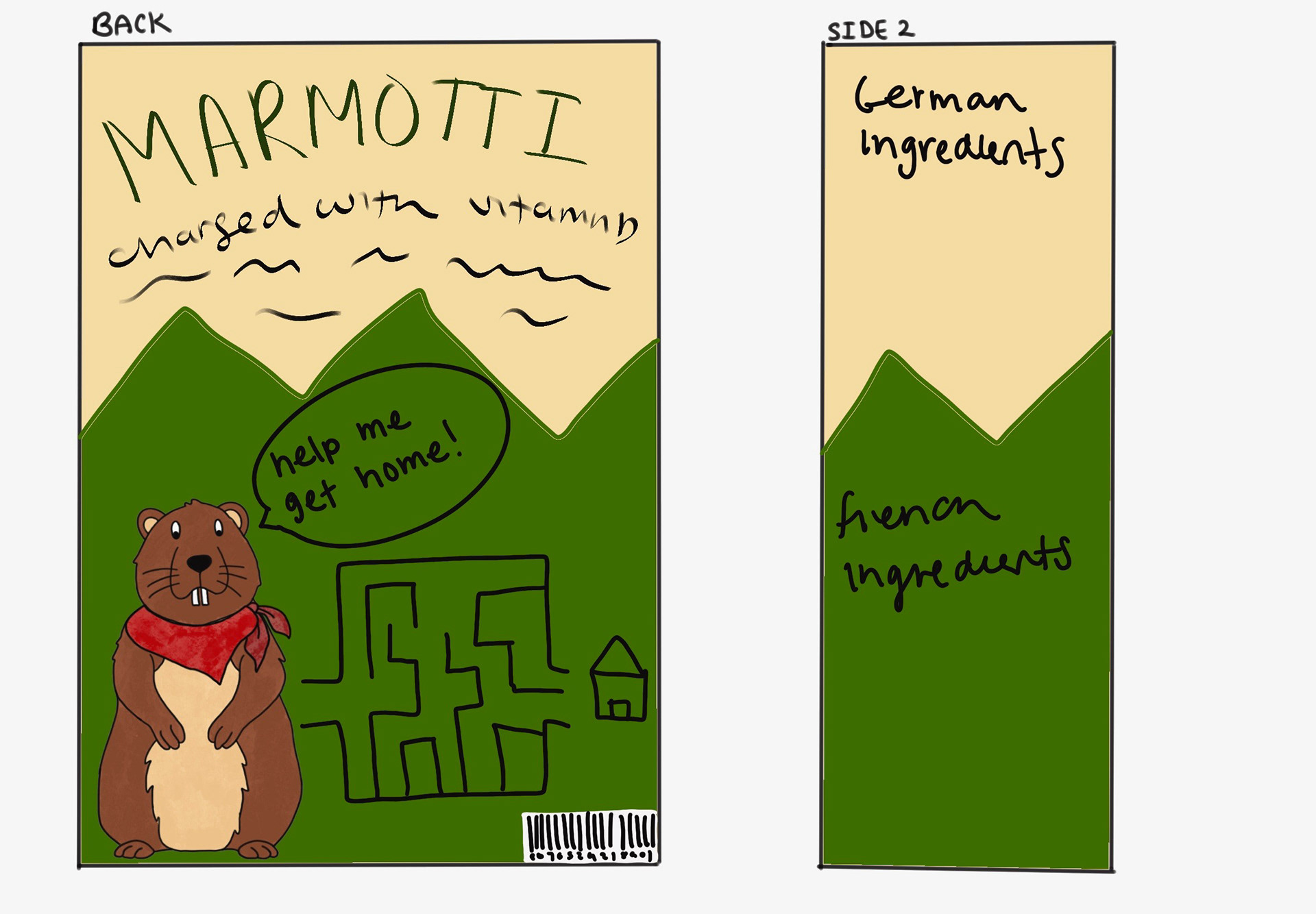
The layout treats French and German as equals at every level. Both languages use the same typeface and the same font weight. Italic differentiates one language from the other without creating a visual hierarchy. Every text block was tested for balance so that the box reads as designed for both communities, not designed for one and translated for the other.