With the creative brief in mind and the visual direction I wanted to take the restaurant, I started conducting research and establishing a lot of the pieces from the concept deck. This includes brand positioning, audience analysis, BRAND STRATEGY, AND MARKETING CHANNELS.
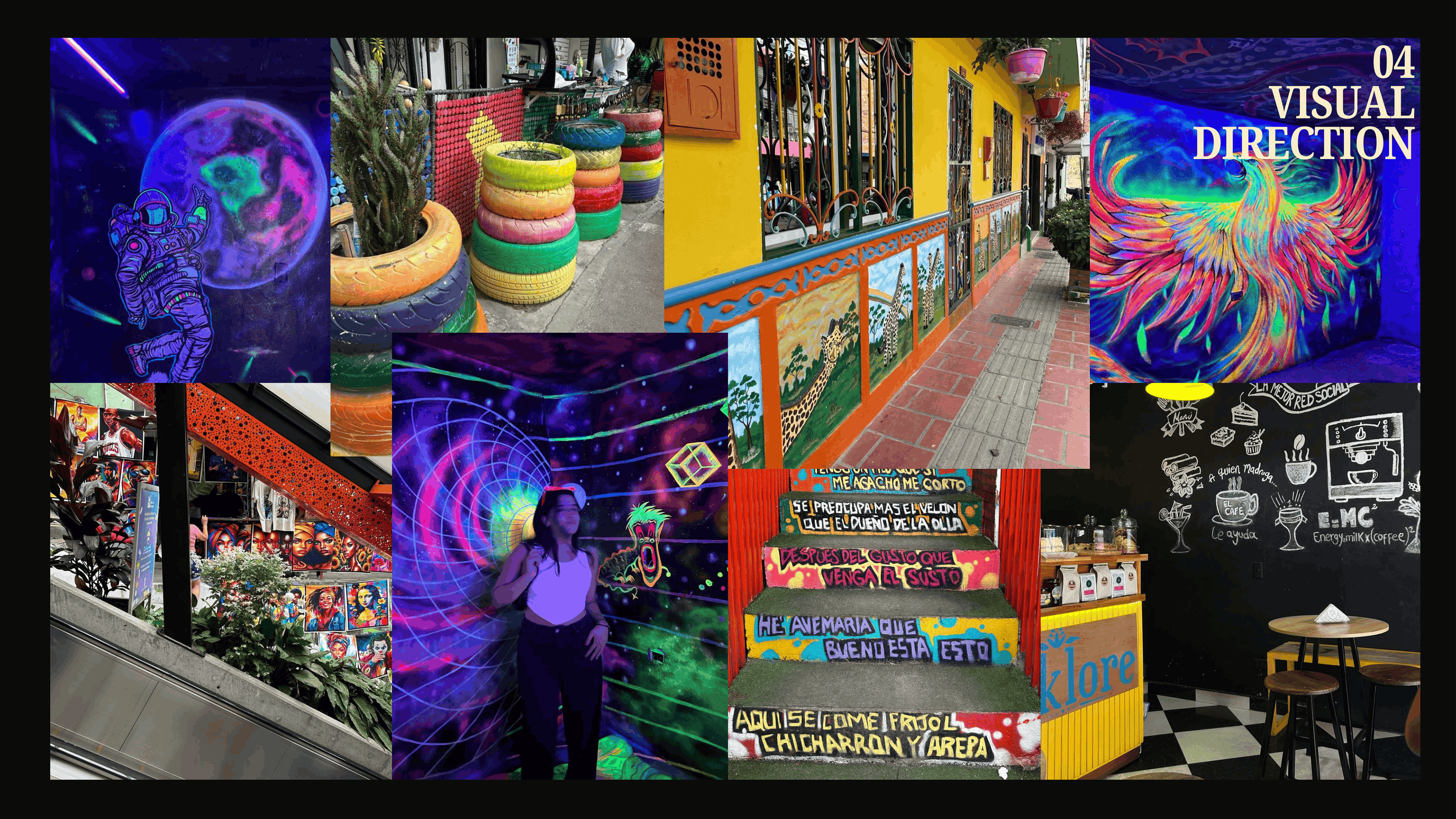
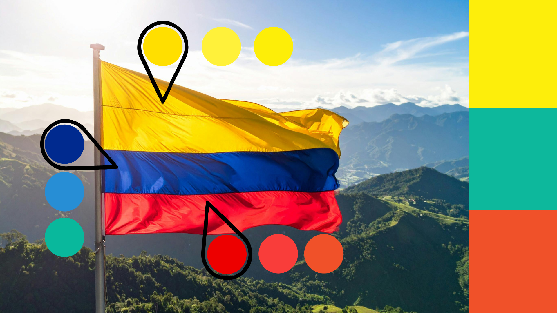
After I had a clear idea of what the brand stood for and how I envisioned it, I focused on creating the color palette. I KNEW FROM THE START THAT I wanted it to reflect the Colombian flag in some way, but I also wanted the colors to be bold, bright, and bring a fun energy to the nightlife of Miami. I asked myself what the flag would look like with the colors brightened all the way up. After playing around with that concept, I landed on the three main colors for Ruidos Brand.
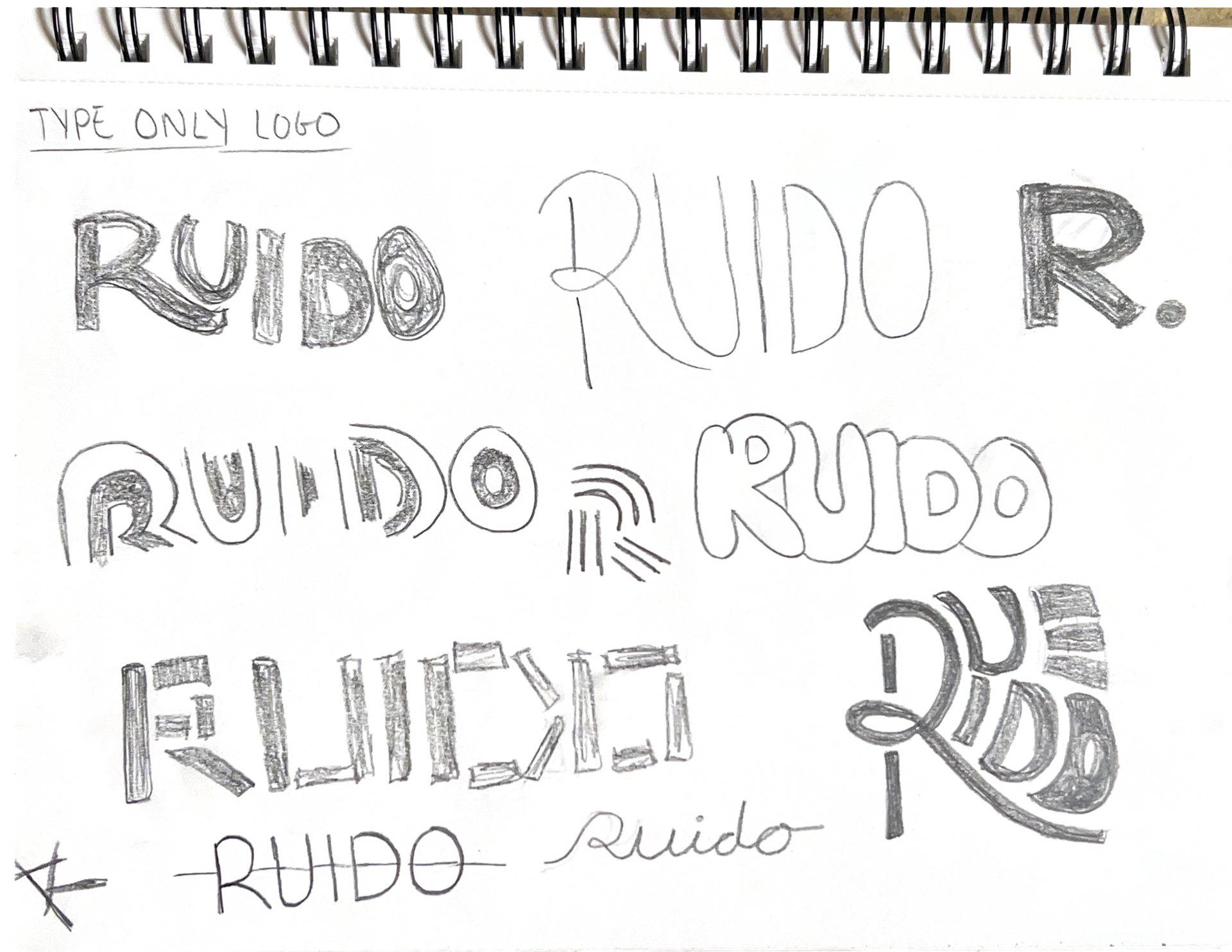
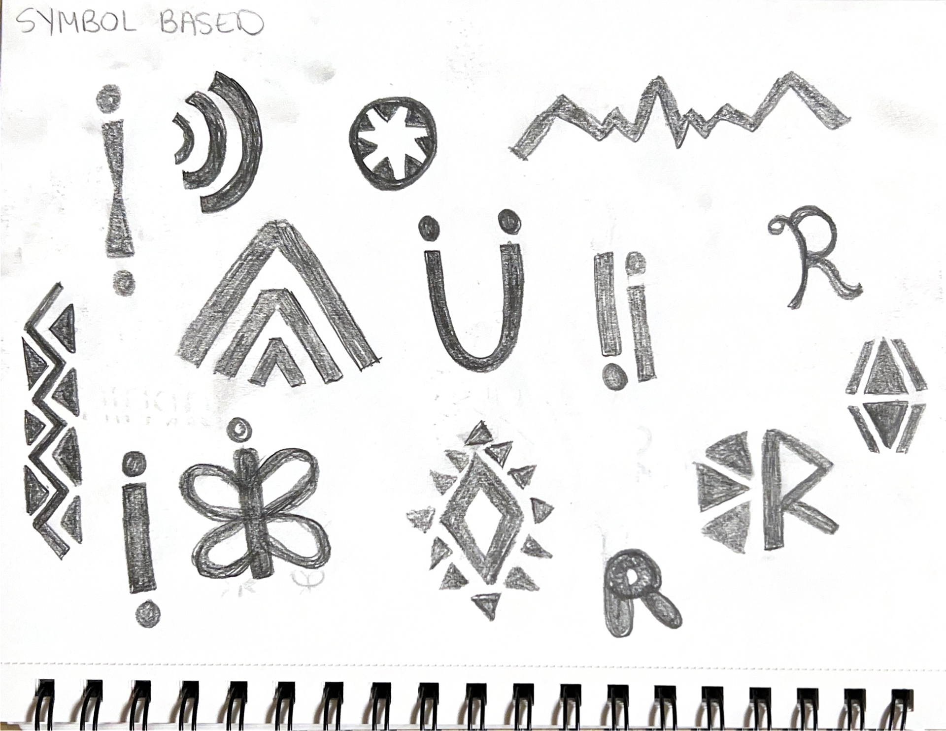
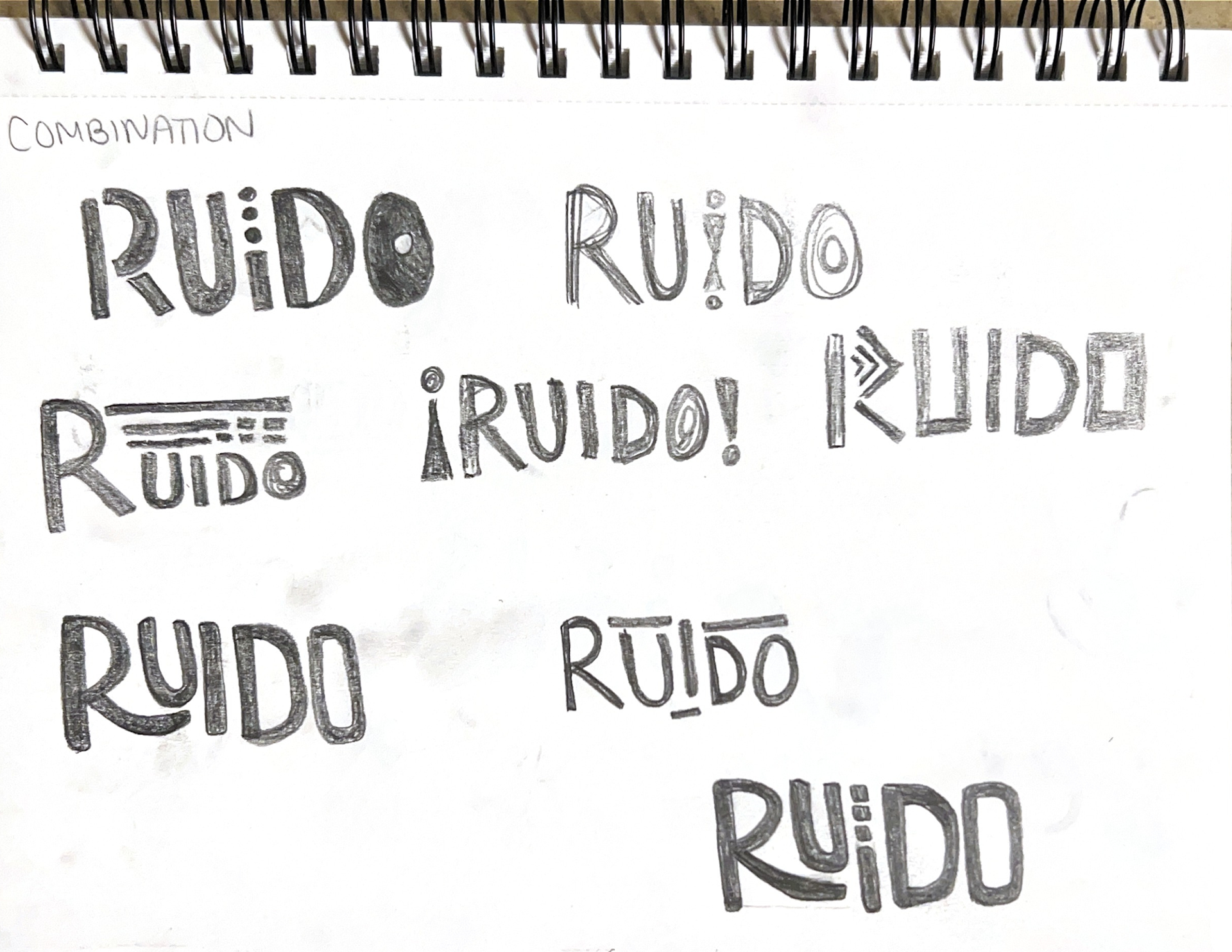
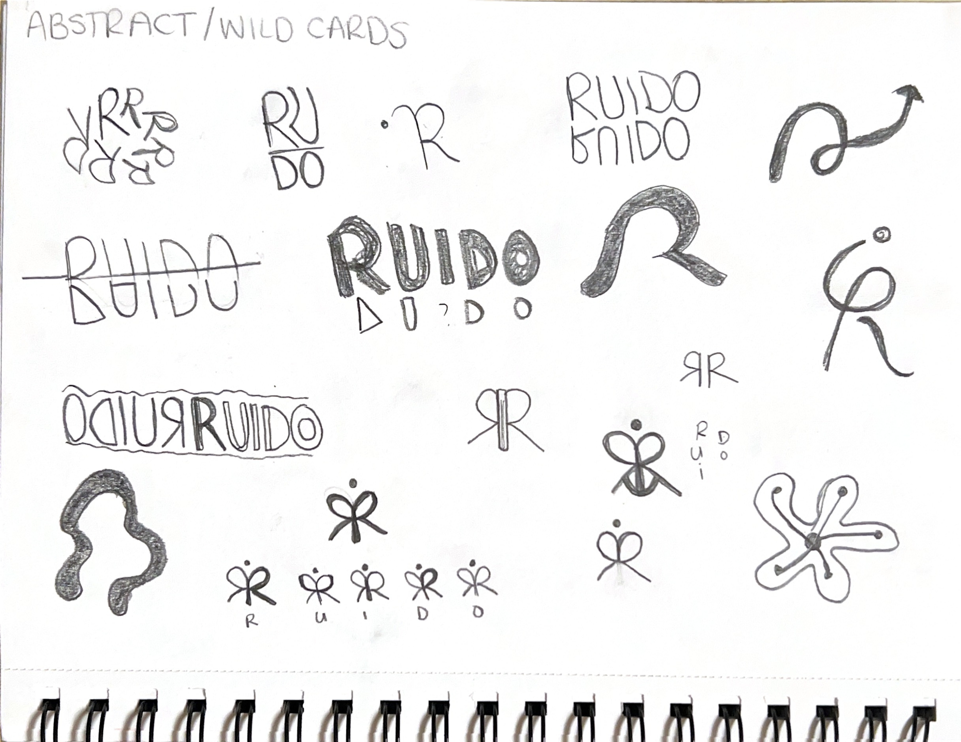
The logo went through a lot before it landed. Early sketches explored the butterfly R, the Monarch butterfly migrates from Colombia to the United States every year, which felt like the right symbol for a restaurant built by someone who made that same journey. To develop the logo, I did an ideation exercise in which I limited myself to working within certain constraints: type-only, symbol-based, combination, and abstract.
The type-only section gave rise to the idea of the R to underline the U. From this combination, the actual logo mark with the dots in the i emerged. Lastly, THE ABSTRACT GROUP CREATED THE BUTTERFLY MARK, IN WHICH I WAS ABLE TO SUCCESSFULLY INTEGRATE ALL THE LETTERS OF RUIDO'S NAME TO FORM A SYMBOL.
Some of the Patterns and illustrations for the branding also came from the logo exploration, while others were pulled directly from Wayuu textile patterns.
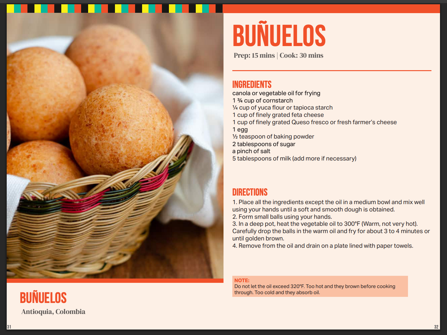
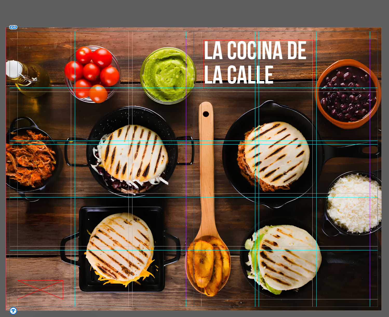
Once the branding was fully developed, I began the cookbook portion of this project by conducting research and selecting the best images and recipes that fit the content I was looking for. I wanted the cookbook to be divided into three sections, so I created a list of recipes from different sources that fit into these categories. I also knew that I wanted my photography for this cookbook to be close-up, detailed images of the recipe it was showing. I made a folder to collect all these images in one place, so it was easier to place them in InDesign later. Here is a document containing all the links to the images and recipes I used to complete this cookbook design.
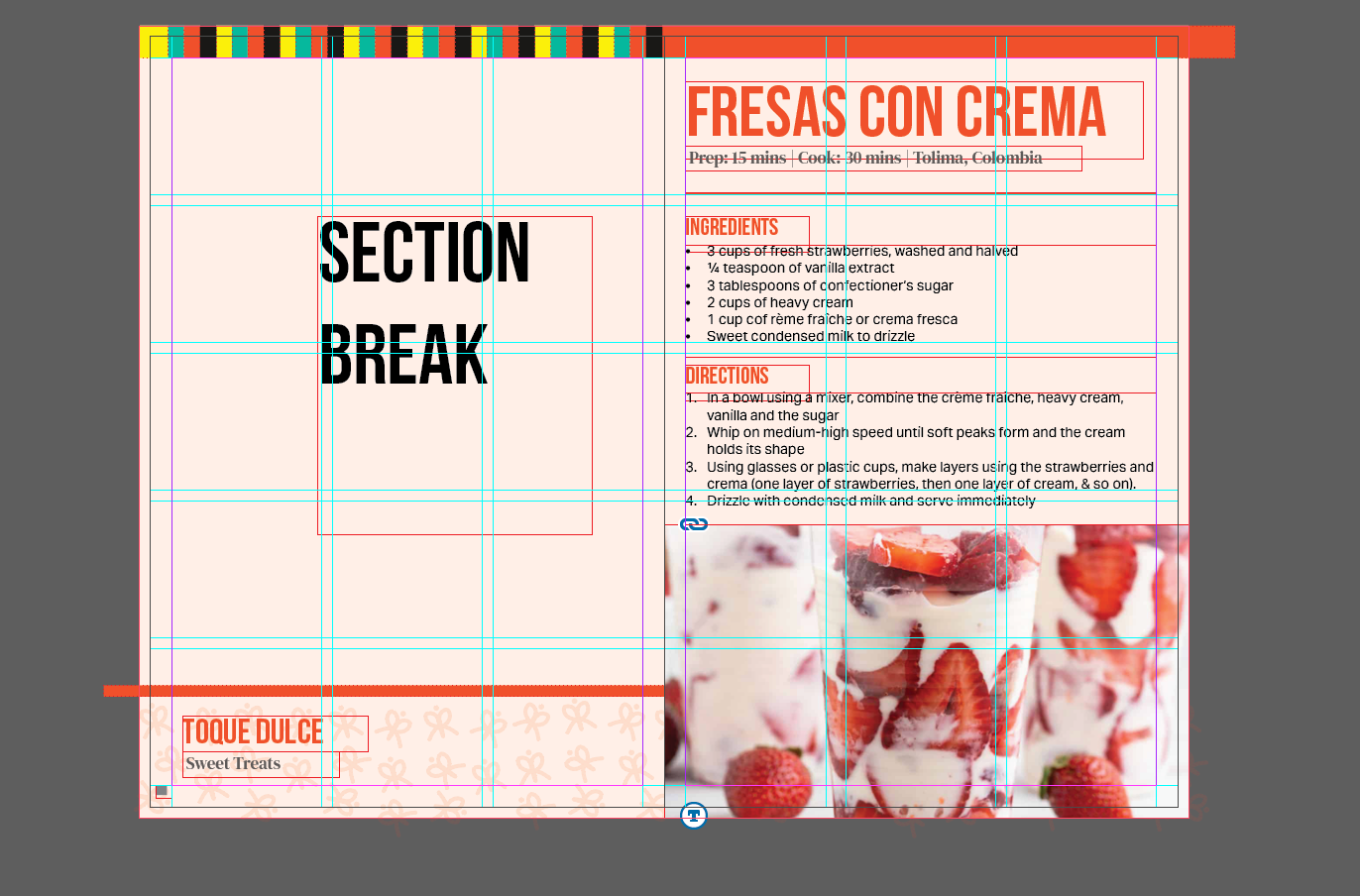
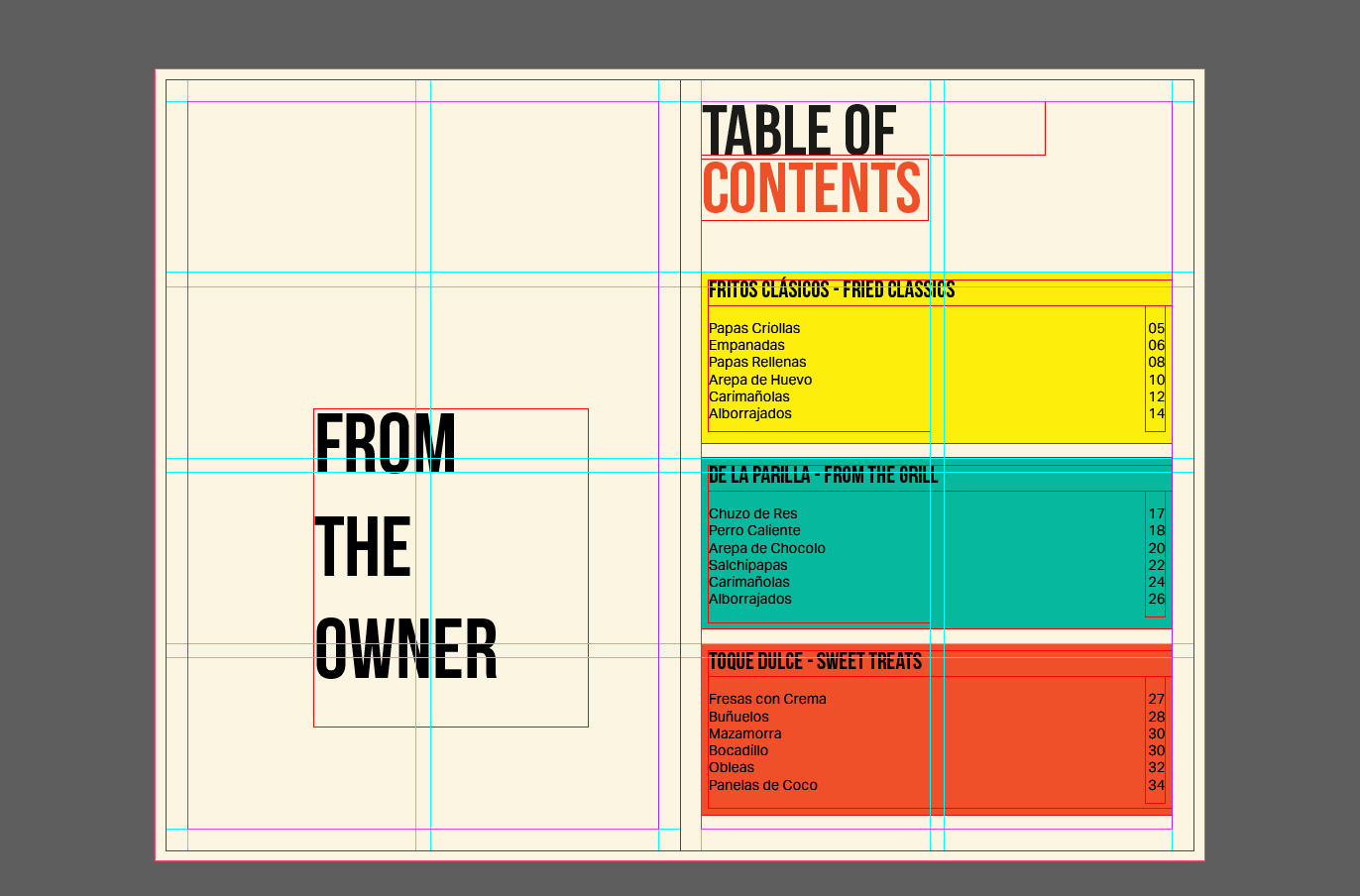
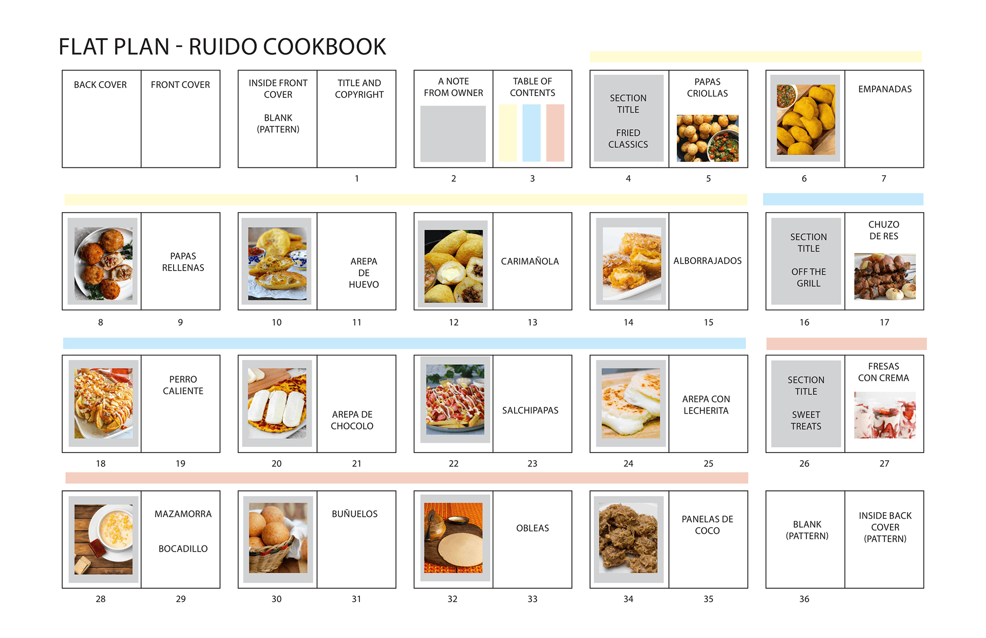
Once I had a document outlining the recipes I wanted to showcase, I CONTINUED THE PLANNING PHASE BY creating a flat plan. The flat plan forced every recipe to earn its place and its spread. It also helped me decide what recipes would serve as section breaks, SINCE THEY WERE THE SHORTER RECIPES. Having the physical structure mapped out before I touched a single page made the design decisions easier because the sequence was already established. The flat plan broke down the selected recipes into three sections and gave them all a home.
I started developing the design on InDesign BY CREATING A SINGLE SPREAD. This served as the base for the rest of the layout. From there, I developed the three sections and the additional non-recipe pages. The last part of the project was the cover. I wanted this to be the last piece created, since it would tie the whole cookbook together.