Computers compute. Teachers teach. Police police. Therefore, designers design, right? If those first couple of sentences made your head hurt (and yes, they are complete sentences), you’ve already begun to understand the value of writing. Those sentences are perfect examples of how much weight a single word can carry. Words and writing will always matter, no matter your job.
As designers, it’s easy to get lost in the “designing” of projects without taking the writing component of our work too seriously. Writing shows up in design in ways I had never even thought about and can be broken down into internal and external avenues. This article from Medium helped me realize that writing is a fantastic tool for reflection. Writing provides a way to think through ideas, communicate your emotions, and translate your decisions into something people can digest. The author of the Medium piece described writing as “designing with words”. This quote stuck with me because, as simple as it sounds, I never thought of it that way.
The more commonly considered side of writing in design relates to tangible deliverables. This is the route I initially thought about when asked about the connection between writing and design. Go Media’s perspective on how writing shows up in design is very similar to my initial point of view. As designers, we have to communicate with clients and team members and explain our process through briefs, proposals, pitches, and design statements. This would obviously be very hard to do without writing. Having clear sentences, correct punctuation, and clear meaning effectively strengthens our design work stronger. So yes, designers design. But designers who can write, design better.
Keywords: Designer, Reflection Tools, Communication, Writing
Have you ever looked at display typography, like a movie poster, magazine cover, advertisement, etc., and gone, “What…Is this?” Maybe you’ve even said, I could do it better myself? Maybe it’s the opposite: you see something so good, and you think, “What a genius!”The reality of design is that we all use the same principles; maybe you’ve heard of CRAP when designing visuals, or POUR when making accessible interface designs. What makes designs different is how these principles are incorporated. Just like there are principles for design, there are principles of typography that outline how text should appear in display pieces. Carl Dair made it simple for us by outlining 7 principles of typographic contrast: size, weight, form, structure, texture, color, and direction. When used appropriately, these principles help us create unique, eye-catching visuals that achieve our goals.
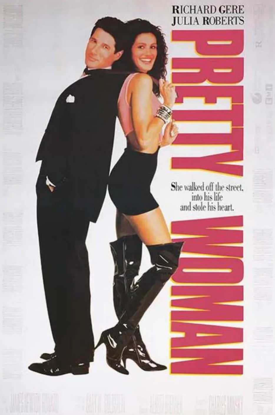
This poster above for Julia Roberts’ Pretty Woman is a fantastic example of these principles working together to create a cohesive hierarchy. Direction and size are working together to immediately draw your attention to the movie’s title: Pretty Woman. Your eyes then flow naturally back to the top of the page to catch the actors’ names, and lastly a little blurb (which is smaller in size) about the movie. As the consumer, you are never feeling overwhelmed or confused about where to look. It’s crazy how something so simple, less than 20 words, invites you to continue wanting to learn more.Now, this doesn’t mean you should use ALL of these principles in a single project, or you might end up with something more like the picture below.

This is an example of Dair’s principles being applied incorrectly, or actually, not at all. When designers try to incorporate all of the principles into the same design, we end up with these elements fighting for attention. The size differences between the title (I’m assuming) and the body copy are fine. However, within the title, we’re left confused as to where to look because it’s all the same size, weight, and structure, which essentially means it’s all in the same font and has no visual variation. Although spacing isn’t one of Dair’s 7 principles, it’s important to mention it for this example since the crowded type is leaving no room for letters to breathe. When done intentionally and well, this is a great technique for adding visual interest. In this piece, however, too many elements are already competing for the spotlight.
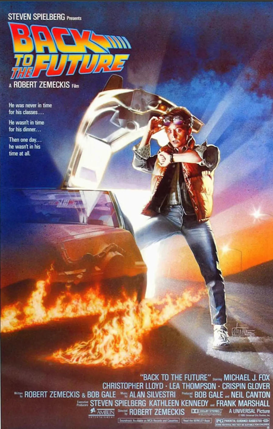
The key to mastering Dair’s principles and creating display pieces that resonate with your audience is balance. This poster from Back to the Future has a lot going on, and it even has the extra layer of visuals and effects. However, even with more elements, it doesn’t feel nearly as cluttered as the musical theory example from above. This is because the type has breathing room, and the elements aren’t competing for attention. The main image in the poster is directing your eyes to where to look next. The title of the movie holds the strongest hierarchy by being both the biggest text and the most colorful, two of which are principles of contrast according to Dair.
This is all to say that good typography is about understanding how the choices you make affect what people notice and how they experience your design. Dair’s principles give us a starting point, but it’s up to the designer to decide how much to lean on them and when it’s best to leave something out. So the next time you see a movie poster and think, “I could do that,” the reality is, you probably could. Especially if you stick to some basic typography principles and know a thing or two about design.
Keywords: Design, Dair’s Principles, Typography, Contrast